My First Still Life of The Year. From its Development to Completion.
My First Still Life of The Year. From its Development to Completion.
Greetings and salutations Everyone!
In this post I thought I’d share my latest finished and first still life painting of the year as well its progress until completion.
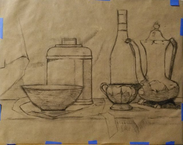
At first I began with an armature drawing of my still life setup. I made sure that the size of the paper was the same as my painting surface as to avoid any spatial relationship issues as well as securing a solid transfer onto the canvas in the next step.
After finishing the drawing, I then covered the back of the drawing with charcoal using vigorous strokes. Essentially, this technique is similar to using transfer paper, but instead the drawing itself functions as said paper.
I then taped the drawing back onto the painting surface and traced over my initial charcoal drawing with a standard ballpoint pen. Theoretically you could even use a skewer, but I like using the pen as it helps to show where you’ve been. You want to make sure you’re pressing hard throughout tracing the drawing. It’s all too easy to lose information in your block in drawing.
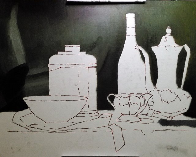
I then removed my initial drawing and sealed the charcoal transfer with an Indian Red Faber Castell Pitt Artist Pen. These are one of my favorites as for not only does it dry relatively fast and seals the drawing well, but it also does not have that tendency to show through oil paint. I’d say Micron pens are pretty good too. Just make sure that you do NOT use a ballpoint pen….or a sharpie!!
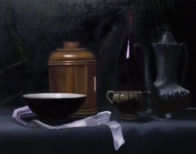
After I found the ink to be dry, I then started to mass in the drapery in the background.
...Then worked on the ground plane, wine bottle and bowl. While keeping in mind that I wanted to keep the darks in the wine bottle and under the bowl, I massed them in using mixtures of alizarin crimson and ultramarine blue.
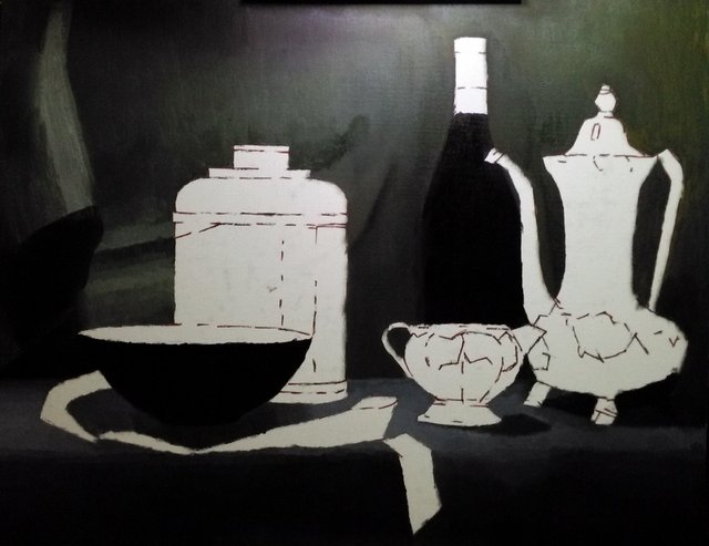
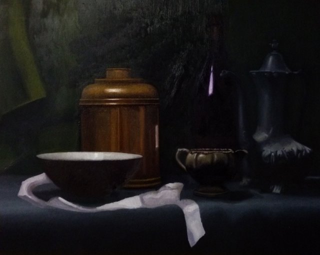
With the intentions of methodically moving up and down and across to the left, I then started mixing value strings and began tiling/turning form on the metal teapot with an aim for a direct final finish. The value strings for the teapot primarily consisted of ivory black, yellow ochre, and titanium white. For the shadows I used cadmium red and ivory black to keep them warm. I treated the shadows on the small cream container the same way.
I then started on the large copper container. This part was very tricky yet enjoyable. It’s pretty easy to get lost in the reflections in metal.
Once the copper container was finished, the next step was of course the ribbon and then I noticed that the foreground below the ground plane needed to be pushed a little further.
Now that the initial pass is complete, I then noticed that as suspected the colors were starting to appear sunken in and matte looking. I then to strategically oil out the sections I was going to work on each day. I decided that the drapery in the background needed to be pushed in value and chroma (more green).
..Then I began to break down some of the smaller forms on the base of the metal teapot. I also refined some edges where the wine bottle meets the background.
Now starting the second pass on the copper container and bowl, I made sure to remain very observant in the transitions and edges. I made sure to make those highlights as strong and tactile as I could!
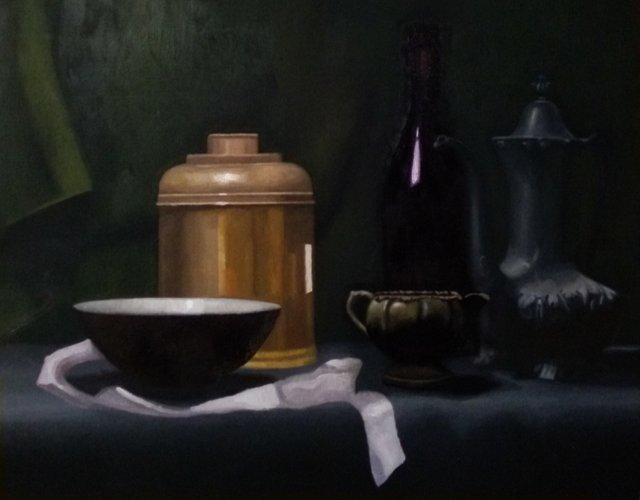
I found reworking the ribbon to be particularly enjoyable in that it felt like there was an endless combination of soft and sharp edges as it lay around the bowl.
Finally I decided to work some subtle folds and transitions in the background, especially around the copper container to add interest.
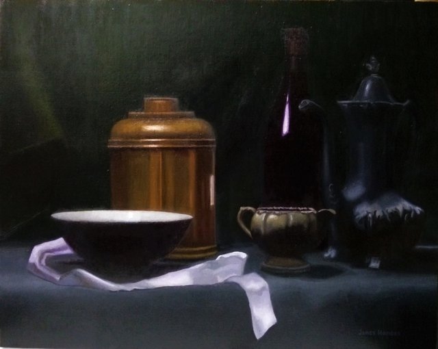
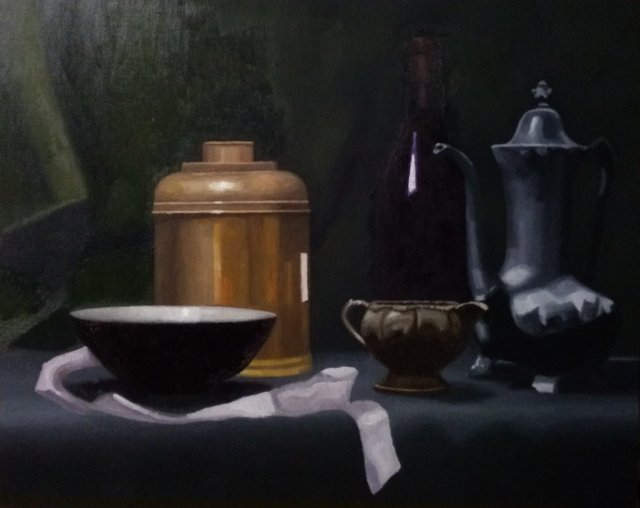
...And now it's done!!
The palette I used for this painting was titanium white, cadmium yellow light, yellow ochre, quinacradone red, cadmium red, alizarin crimson, ultramarine blue, and ivory black.
Teatime Still Life
16" x 20"
oil on canvas
2018
Please feel free to let me know what you think?
Thanks for reading Everyone!
-James Hansen
Nice Painting James. First, before I give an honest critique, I'd like to say I cannot paint this good. My thought was, the bottle seems to be lost into the background from being too similarly colored. Perhaps it is your camera exposure, perhaps you wanted it that way.... just a thought. I am a strong believer in constructive criticism...and the Steem community is seriously lacking. ~Cheers
...and, I thank you for taking the time to show your process.
Thank you so much, I really appreciate that! :) Yes I do believe that your speculative interpretations are correct. I do admit that the skill of photography is still an entirely different animal and relatively new to me and is yet a beast that needs to be tackled. I need to invest in a new camera that's for sure!
And I am very appreciative in your perspective/attitude, as I value the same. The bravery in having the willingness to look at our weaknesses and challenges only make us stronger. Kanpai!
Well said.
James, I wanted to let you know I painted my first ever still life and thought you may want a look.
Classy self promotion. ~Cheers
Great detailed post!
Thanks a lot David! :)
Wow, stunning work @jameszenartist. Great to see all the processes you go through as an artist. I can imagine the ribbon part was especially hard to work on, catching all the different sections of light. Keep it up. Following and resteemed, can't wait to see what else you produce.
Thank you so much, I really appreciate that! Surprisingly enough, the ribbon was one of the easiest and fun parts to work on. To tell you the truth, the most difficult task was keeping my darks clean, unified, and from continually sinking in. So with this in mind, I can't stress enough in working methodically, instead of randomly all over the place. So when you oil out, you have to do it in sections so that if it sinks in and it will, it'll be okay as you know the values were correct when you painted it.
I can assure you there's going to be more great stuff so stay tuned! ;)
Your work really requires a lot of patience. Nicely done
Thank you so much :)
Looks awesome man, such good slight value transitions in the darker areas.
Thanks man! I knew this time I needed to pay extra special attention to the shadows. Also, I've been following a couple of artists from GCA and in a couple of posts not too long ago they talked about using mixtures of cad. red or orange with ivory black for their shadows and I wanted to try it :)
Beautiful! I like the dark blue vase especially. Almost melting into the bakgrund and filled with awesome lost shadows.
Thank you, I really appreciate the comment! :)
Absolutely wonderful! Thank you so much for your inspiring works! Please check out my stuff if you get a moment. Thank you again, your work is something I look up to!
Thanks a lot! I'm happy to hear that :)
Impressive as ever James. You're one of my favorite artist here on the platform. I hope you more success. Keep it up.
Thank man, that really means a lot :) Please keep tabs on my posts as I can assure you that there's going to be more great stuff coming soon! ;)
Wow, man. You did such a great job. I love how realistic-like it looks!
I am definitely following you! I'd love to see more.
Thank you so much, I really appreciate the compliment! :)
If you would like, all of my available work, as well as some archives can be seen here:
https://jameszenartist.weebly.com/
Great work and usefull info shared. Thanks dude.