Steemit Crypto Academy Season 3 Week 2 - Beginner's Course- Homework| Introduction to Charts
Greeting everyone. In this lecture, the detailed knowledge about charts is given for beginners. I am thankful to the professor @reminiscence01 for delivering the lecture in such easy and clear way. Now after reading the lecture thoroughly, i am going to do my homework task. SO let's start.
Explain the Japanese Candlestick Chart? (Chart screenshot required)
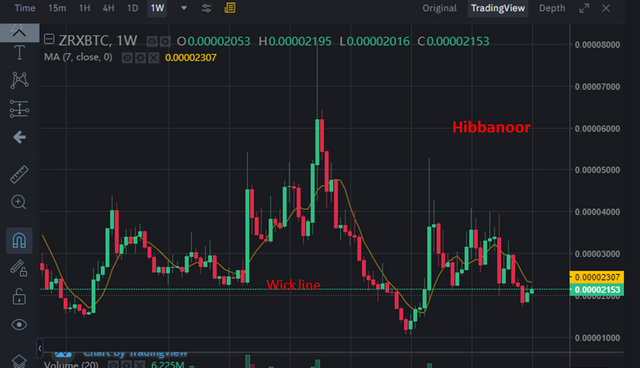.png)
We know that the multiple methods are being use for analyzing the future of market. One of them in technical analyses. The technical analysis method is used by many traders to determine the next moves of market. The candle stick is a tool which is being used in technical analysis . This tool helps to determine the price of coin and next movement of market.
This tool was developed in 1990 by Japanese farmers. Now this method has got a great reputation among the traders. The traders are used this tool widely to to predict the movement in price of assets in future.
Two color are basically used in Candlestick chart: Green and Red. The movement of price is shown using these two colors. The green candles are showing that the market is going up. The price will rise and the uptrend will start in future. On the other hand, the Red candles represent that the price will fall and market will downtrend in future.
The demand and supply concept is use in this tool and this tool provide a detailed information to the trader about future price of crypto asset. This tool provide a detailed knowledge about price movement and help the traders to take the decisions about crypto world. This chart provide the information about opening and closing prices of an crypto assets in crypto world for specific duration. Moreover, highest and lowest price is also shown in this graph.
The support and resistance lines are used here. These also help the traders in candlestick chart to predict the future of market. In candle stick chart, if wick line is below, it refer to the lowest point of price within a specific time duration. It show the support level. But if wick line is above, it represent the resistance level.
Key points
- Two color candles are used in candle stick chart: Red and Green.
- The red color shows the downtrend
- Green color shows the uptrend
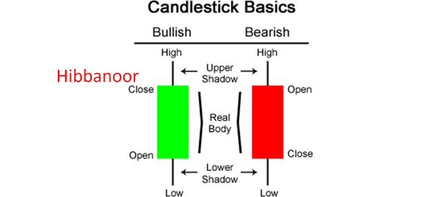
High: It refer the highest price of a coin within a specific time period.
Low: It refer the lowest price of coin at the specific period of time.
Open: It refer the opening price of coin
Close: It refer the closing price of coin
Wick: This line shows where the fluctuation in price is occuring.
Real Body: The real body shows the difference between the opening and closing price of a crypto asset.
In the above chart, the market was at its uptrend from March 15 to May 15. There were very little downtrend during this duration. But after Mid of march, a downtrend start and still market is at its downtrend.
Describe any other two types of charts? (Screenshot required)
Line chart
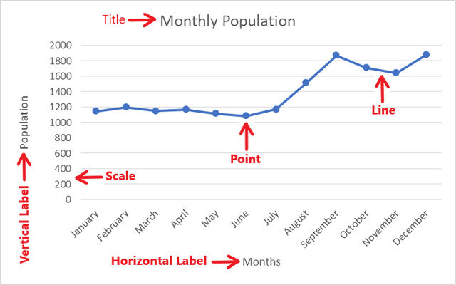
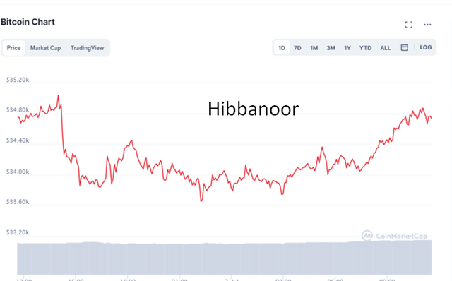
Line chart is very simple. It has only one line and show only the closing price of a coin during a specific period of time. This chart provide a detailed information about market. This chart is easy to understand and mostly used by the investors who perform the daily base transactions.
The opening price, low price, high price etc are not shown in Line chart. Only a single line is there representing the closing price of coins. If line's direction is upward then market price is rising and if the line's direction is downward then the price is falling.
Bar Chart
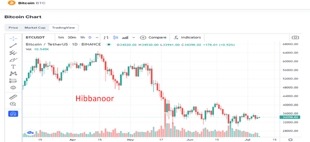
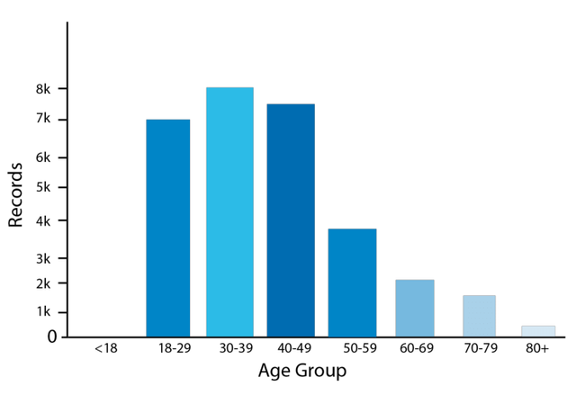
In bar chart, the lines or blocks are being used. These lines show the fluctuation in price. These shows how much the price goes up or down. This chart is more informative as compare to line chart because here you get the opening price, high price, low price too.
The maximum and minimum prices of assets are shown by the vertical line in bar chart while horizontal lines are used for showing the high and low prices of coin. If you see the graph for long term, it will show the the high difference in price. And if you want to know about market just for today, they you will see the one day graph or the time you want.
Mostly this chart is use for long term trading. Here the traders get the clear idea quickly about the market trend. When they see the bar chart, they quickly determine whether they should make an entry or this is the time to exit the market.
In your own word, explain why the Japanese candlestick chart is mostly used by traders.
There are many reason why the candle stick chart is most widely used in crypto world for predicting the future of market instead of other charts.
1- It is simple and easy to understand. It provide the detailed information about the market to the trader.
2- You get the high and low prices of assets too in Japanese Candlestick chart.
3- The color of the chart shows the trend of market. If the green candles are more than market is rising up and if the candles are red, then market are going down.
4- Many traders are perform the trading using this fundamental chart. This chart provide the detailed information about market trend and price of asst.
5- It help the traders to determine that whether its bullish trend or bearish trend. The trader can easily determine this by just looking at the color of chart and length of candles. By using the past price and current price of assets, the trader predict the future price. It help the user to determine whether or not should enter in market. The user use it and earn a good profit too.
6- The demand and supply concept is use in this tool and this tool provide a detailed information to the trader about future price of crypto asset. This tool provide a detailed knowledge about price movement and help the traders to take the decisions about crypto world
Describe a bullish candle and a bearish candle identifying its anatomy? (Screenshot is required)
There are two trend : Bearish and Bullish
Bullish trend
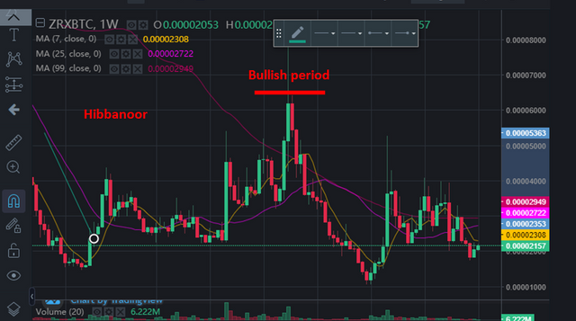
Bullish trend is also known as uptrend. In bullish trend, the direction of candles is upward and color is green. When the users invest their money in the coin, the demand rise which raise the price too. SO market uptrend start there.
Bearish trend
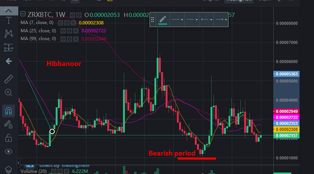
The bearish trend is also known as the downtrend. In bearish trend, The direction of candle is downward and color is red. When the price reach the highest value, the investors sell their coins and earn the money. Then the supply become more and demand is less. The prices fall and bearish trend start there.
Candle Opening point: This is the point when the market start building. It refer to the opening price of an asset. This is the time when the candle are begin to built for specified period of time. At this time, the market is begin to going up.
Candle Closing point: This refer to the closing price of asset for specified period of time.
Lowest price: It refer to the The lowest price of asset for for specified period of time.
High price: It refer to the high price of asset for specified period of time.
Conclusion
I have learnt about the Candle stick chart in detail. Then bar chart and line chart are discuss. This lecture was quite informative and easy to understand. I am very thankful to the professor @reminiscence01 for delivering the lecture in such easy way for beginners.
Regard

.png)
.png)
.png)
.png)
.png)
.png)
Hello @hibbanoor , I’m glad you participated in the 2nd week of the Beginner’s class at the Steemit Crypto Academy. Your grades in this task are as follows:
Observations:
It doesn't determine the price of a coin. Rather it shows information and interaction on the price of an asset.
This is the default color used for the bullish and bearish candle. However, a trader can chose to customise the candle colors.
Recommendation / Feedback:
You have shown understanding of Japanese candlestick and its dynamics. Thank you for participating in this homework task.