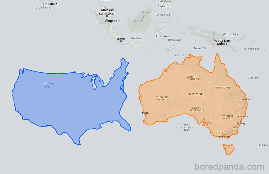
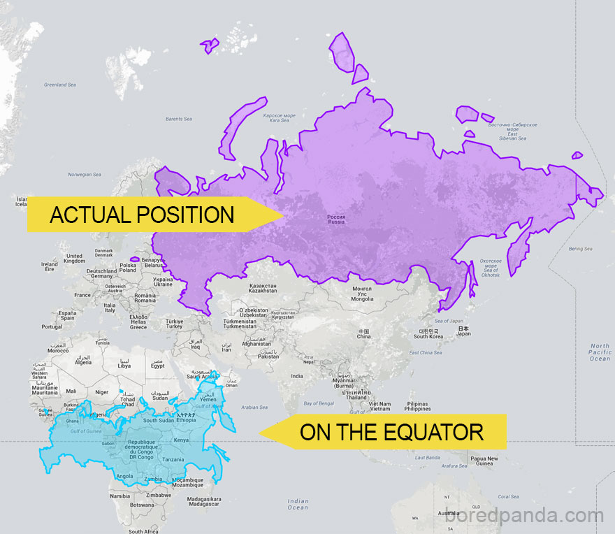
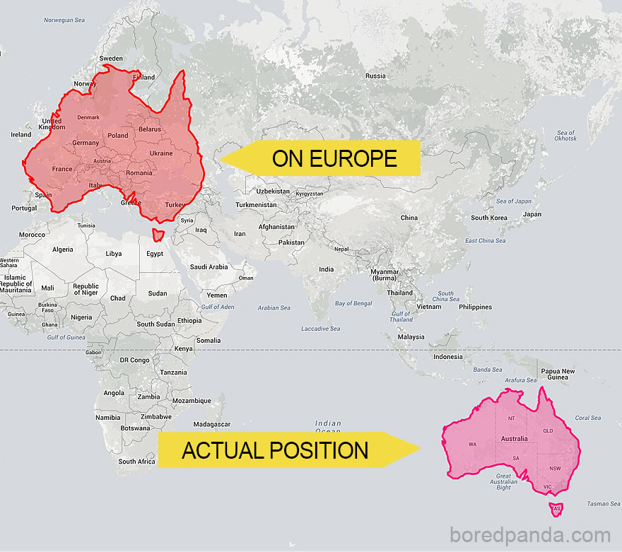
The Actual Sizes of Countries
The Mercator Projection makes countries appear smaller/larger than others. Placing a 3D planet on a 2D map was a big challenge for early cartographers and a Flemish cartographer Gerardus Mercator designed a unique solution. In 1569 Mercator designed a map that was practical navigation purposes, but the downside was that his system distorted the size of objects depending on their position relative to the equator. So, landmasses like Antarctica appeared much larger than they really are.