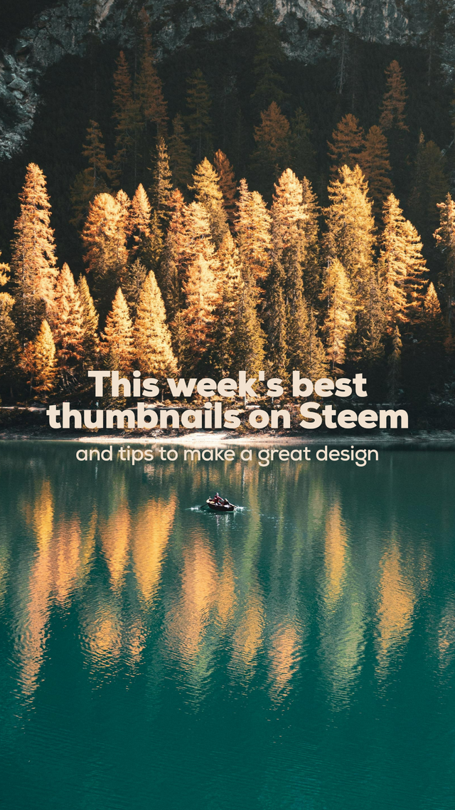
Steem's best thumbnails of the week: a weekly showcase + design tips + 28 STEEM in prizes
The thumbnail is an essential element of a great post.
Hey guys, this is the second week of Steem's best thumbnails of the week showcase + design tips and for this week we have 28 STEEM in prizes. The 18 STEEM I give out plus @preparedwombat's generous donation of 10 STEEM for this week's winners.
The reason for this pseudo-contest / showcase / giveaway / design tips post is that I've identified a painful point here on our Steem blockchain: the lack of graphic design skills on most post's thumbnails.
If you go to trending (which is the face of Steem to the outsiders and newcomers), you'll only see a graphic design clusterfuck. This is unacceptable, in my opinion.
So, in order to foster good and simple practices of graphic design, every week on Wednesdays:
- The best 6 thumbnails of the past 7 days, will be selected.
- Prizes in liquid steem will be given to the first three places (1st place wins 9 STEEM, 2nd place wins 6 STEEM and 3rd place wins 3 STEEM). This week we have 10 more STEEM to give away: 3 extra STEEM for the first three places and 1 STEEM for @null to burn (thanks to @preparedwombat).
- I'll dissect each thumbnail and expose the reasons why I think it's great design. This will serve as tips that you can apply on your thumbnails to better your designs and possibly win on the next week.
The criteria to be selected:
- Thumbnails must be from individual authors. No thumbnails from projects or companies will be selected.
- Thumbnails must include text.
Bonus points
- Thumbnails must look good across all Steem front ends. Specially @Partiko, because this dapp has a weird way to crop thumbnails. For example, if you place text too close to the borders, it will be cropped out. If your thumbnail's aspect ratio is not 16:9, you need to make sure your text is dead center vertically and inside an imaginary rectangle of 16:9 ratio, and with some bleed from the side borders in order to avoid text cropping (see this post's thumbnail for a good example on how to set text that will display properly on all Steem front ends).
This week's best thumbnails are:
It took me a great amount of scrolling and browsing to come up with these six thumbnails.
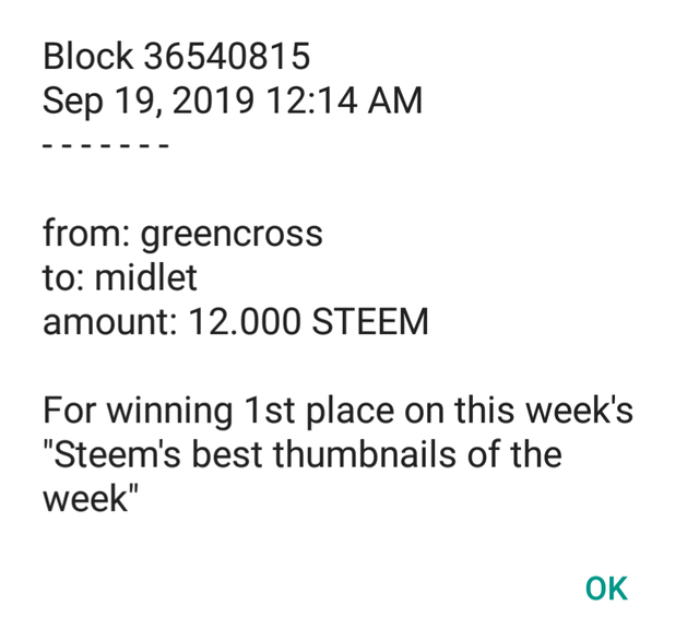
1st place winner 9+3 STEEM: @midlet and HF 21(22) and #Newsteem Have Exceeded My Every Expectation
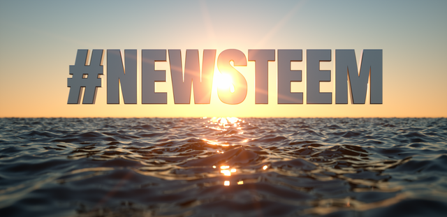
Tips to note from this thumbnail:
- the text is perfectly centered on the graphic
- there's enough bleed around the text in order to "breathe" in space on the thumbnail
- the text is perfectly readable on very small applications
- this one is special and won the first prize because the thumbnail is not only effective in terms of graphic design, but @midlet created it out of a 3D model that he modelled himself. The letters, the sea and the light resembling the sunshine are all a render of a 3D model specially made for the post.
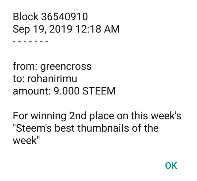
2nd place winner 6+3 STEEM: @rohanirimu with We Found Paradise! (eventually)
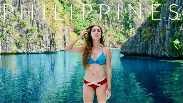
Tips to note from this thumbnail:
- the text is placed over the main subject in the thumbnail, giving the single word it's own space on the design, while respecting the surrounding elements
- the word "Philippines" is perfectly readable against the background image, although I'd preferred a thicker typeface (but this is only personal taste).
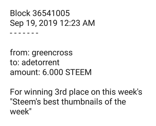
3rd place 3+3 STEEM: @adetorrent with My News Filter Is Working
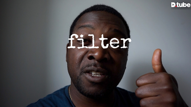
Tips to note from this thumbnail:
- this one goes against everything I'd classify as rules to respect for a great thumbnail design, but it is exactly that what makes it awesome. The rules are sometimes to be bent and broken. In my rule book you should never lay text over the image's main subject, but...
- the text is perfectly readable and it has been placed exactly over @adetorrent's eyes, bringing the theme of the post straight in your face by creating some sort of "sunglasses" (light filters). This creates a strong visual representation of the theme in the post
- the minimalism in the design is a trademark of Ade's thumbnails and it's always perfectly executed, thus reinforcing his personal branding.
4th place: @nonameslefttouse with Please Stop Taking Your Shits Above The Heads Of Actual Content Producers: Thank You

Tips to note from this thumbnail:
- this is less of a design and more of an artwork, but its form follows function therefore it works as a great thumbnail.
- the style is simple, minimalistic and visceral. It transmits exactly what the author intends, which is a sense of urgency and a bit of anger.
5th place: @paulag with Just a quick thought....Reputation
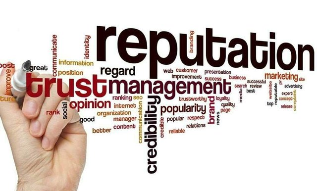
Tips to note from this thumbnail:
- this thumbnail is different to what I'd normally choose, but it indeed catched my attention because Paula used one of those word clouds which focused on the keyword that defines her post. It is clever, although design-wise, I'd have chosen another font (once again this is a personal point of view).
6th place: @directsound with WATERFALL Sounds, 10 HOURS - (BLACK SCREEN) Sounds for Sleeping.
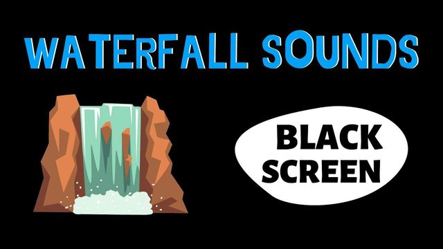
Tips to note from this thumbnail:
- simple but effectively executed: the author has chosen a black background (which describes the "empty" image on the video), a waterfall icon to further illustrate what the publication is about (10.hours of waterfall sounds intended for sleeping purposes) and the author reiterates the emptiness of the video by writing "Black Screen" on big letters with high contrast.
I am looking for judges and sponsors!
In order to make this contest more appealing, I am looking for judges and sponsors for the upcoming weeks.
If any of this week's winners would like to judge the following weeks they are more than welcome. However, you can't win on the weeks you are judging, sorry!
If you would like to sponsor some Steem for our weekly prizes, please feel free to contact me on Discord "greencross#2884"
Once again, thanks to @preparedwombat who donated 10 STEEM for this week's prize pool!.
EDIT: @preparedwombat has sent another 4 STEEM for next Wednesday's prizes. Thanks!
I have burnt 1 STEEM by sending it to @null with a link to this post so it will hopefully be noticed by @smartsteem while executing my STEEM burning duty.
Did I miss any great thumbnail design?
Maybe I overlooked a great thumbnail design. If you think I did, feel free to drop a link on the comments and I'll keep an eye on the author for the next weeks.
Thanks a lot!
@greencross
Posted using Partiko Android
feel free to drop your creative contest post announcements in the CC server #contest channel!
thanks a lot @torico I'll do that next wednesday :)
Posted using Partiko Android
Thank you so much for being an awesome Partiko user! We have just given you a free upvote!
The more Partiko Points you have, the more likely you will get a free upvote from us! You can earn 30 Partiko Points for each post made using Partiko, and you can make 10 Points per comment.
One easy way to earn Partiko Point fast is to look at posts under the #introduceyourself tag and welcome new Steem users by commenting under their posts using Partiko!
If you have questions, don't feel hesitant to reach out to us by sending us a Partiko Message, or leaving a comment under our post!
👍
~Smartsteem Curation Team
yeppeeeeee how cool is that....love seeing my name up there, thanks. My fav is we found paradise one