You are viewing a single comment's thread from:
RE: ICON Digital Network Token Design Contest: Win Steem For Your Design!
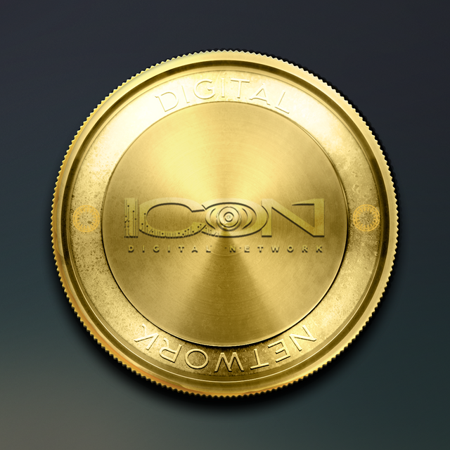
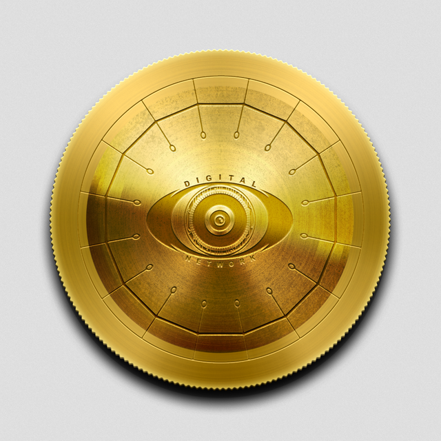
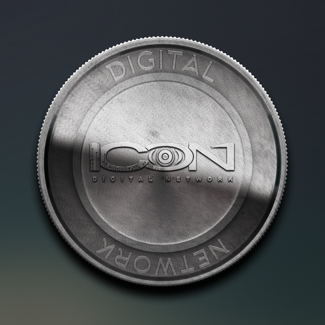
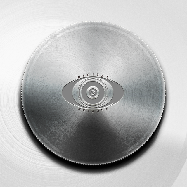
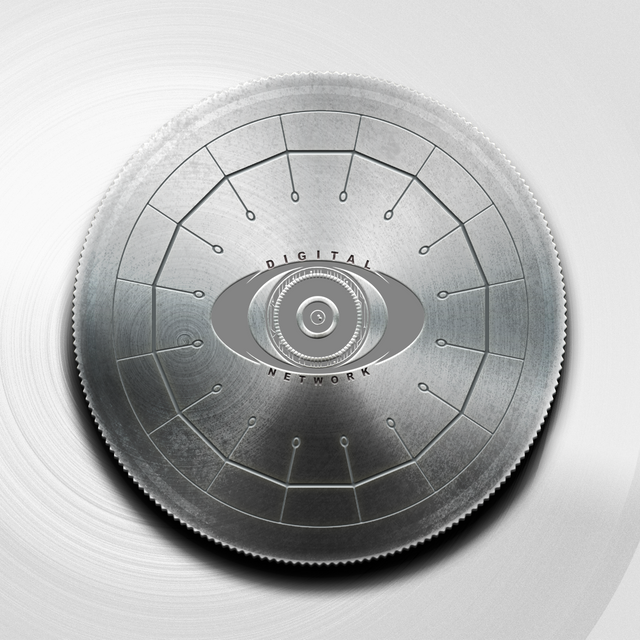
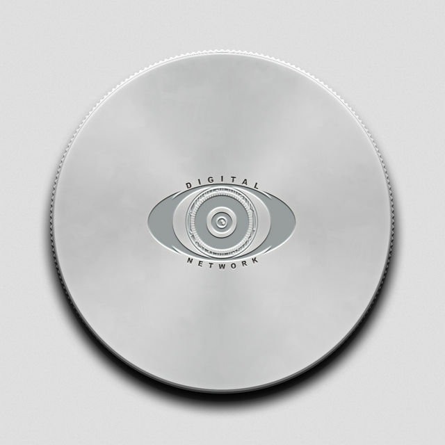
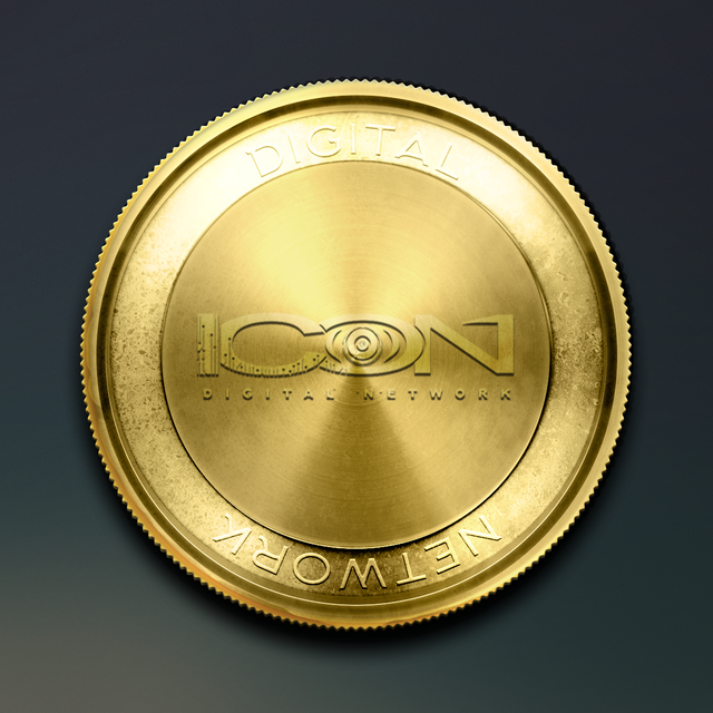
Here are some variations and adjustments i made with respect to the metallics preferred. Any adjustments needed can be made. If any of them appears to be too bright or too dark, i can tone it up or down.
GOLD
GOLD FRONT PART 1
GOLD FRONT PART 2

GOLD BACK 1A
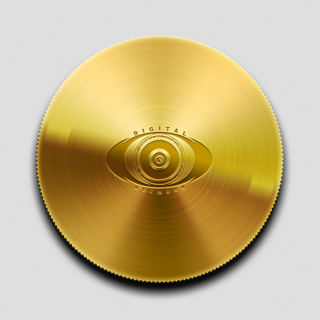
GOLD BACK 1B
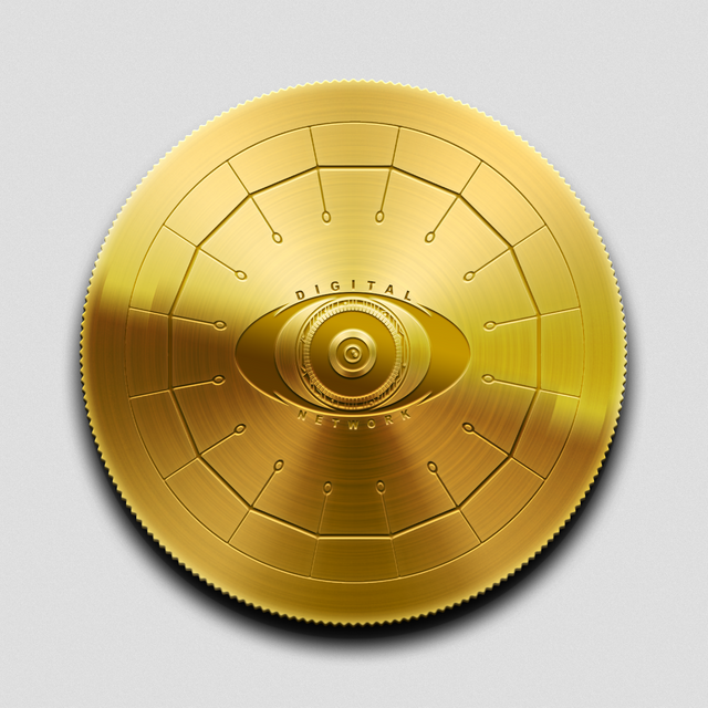
GOLD BACK 2A
GOLD BACK 2B
SILVER
SILVER FRONT
SILVER BACK A
SILVER BACK B
SILVER BACK C
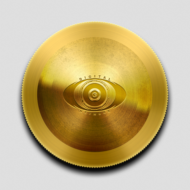
Nice I like the very first one a lot but don't like those 4 circle things.
Okay. I would remove them entirely.
Nice!