Material Design: Color [Note]
In a webpage or any UI, color is far more than providing a striking graphic or visual effect. Proper assignment of colors could give meaning that reflects the brand and style. It could also give meaning to elements on the interface or subconciosly make the state of element understandable without text explanation.
Notes below are taken from the Material design page:
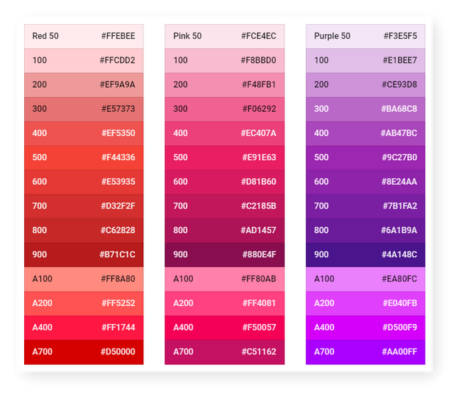
- [Color pallete](https://material.io/design/color/the-color-system.html#tools-for-picking-colors} that created in 2014 represents a series of harmonious color combination.
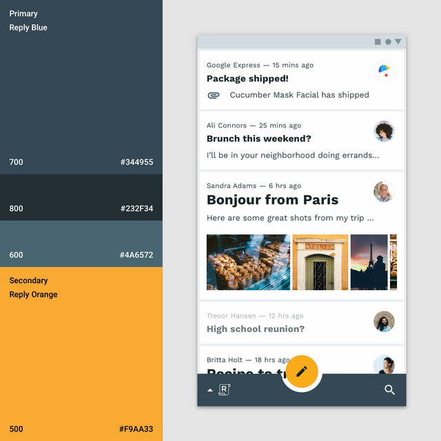
- Use a secondary color is highly recommended distinguish element with different features.
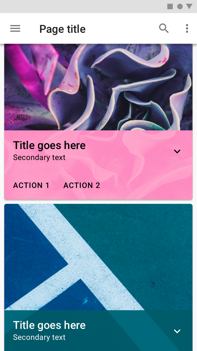
- Use a layer of color as text base for better legibility when a picture was used as background.
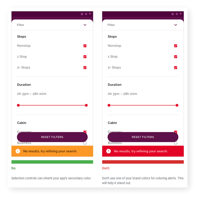
- Use color from different family for alert message to make it outstanding.

- Primary or secondary color is suitable for header or sub header color but body text color should remain subtle at all time.
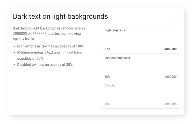
- Opacity of 100%, 60% and 38% bring different meaning to the text.
Posted from my blog with SteemPress : https://fr3eze.vornix.blog/material-design-color-note/
Hi @fr3eze!
Your post was upvoted by @steem-ua, new Steem dApp, using UserAuthority for algorithmic post curation!
Your UA account score is currently 4.060 which ranks you at #3405 across all Steem accounts.
Your rank has not changed in the last three days.
In our last Algorithmic Curation Round, consisting of 230 contributions, your post is ranked at #170.
Evaluation of your UA score:
Feel free to join our @steem-ua Discord server
Congratulations @fr3eze! You have completed the following achievement on the Steem blockchain and have been rewarded with new badge(s) :
Click here to view your Board of Honor
If you no longer want to receive notifications, reply to this comment with the word
STOPTo support your work, I also upvoted your post!
you're absolutely right. ui is undervalued by too many people 😐