Back to the 90's in StackOverflow

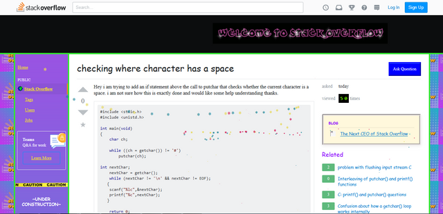
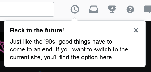
Paying an usual visit to StackOverflow on another normal day at work (can't live without it to get my job done). Instantly I noticed the unusual visual appearance in the website UI. Did not pay much attention as it looks like a page rendered improperly, until I read the special popup message.

Ah it is the April Fool's trick. The whole site with this 90's theme applied pulls the far memories back, look so much alike with the social platform like Friendster before Facebook is a thing. Surprised to see a highly technical site like StackOverflow has this sense of humor too.
Posted from my blog with SteemPress : https://fr3eze.vornix.blog/back-to-the-90s-in-stackoverflow/
That "Under construction" text XDDDD At the time most websites included it. Then morphed into the gif version. Extremely annoying.
Posted using Partiko Android
Good catch, I didn't even notice that wording haha. The running banner at top is epic tho.
lol i love it! is that comic sans font? 😆
Looks like it is Times New Roman lol. Definitely old school!