Flyp.me New Design, New UX: Try the Beta Now!

Hi crypto friends,
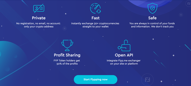
If you take a look at Flyp.me, you might notice something different on the homepage. It’s an invite for you to try out a few major updates to the Flyp.me accountless crypto exchanger. It looks better and works better.
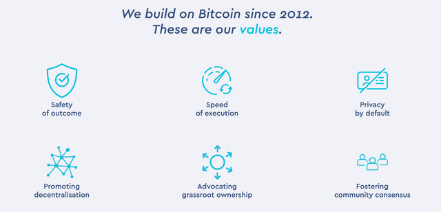
We improved how we tell the Flyp.me story through images, words and key strokes. We stay true to our core values.

We have been talking about it for some time and are happy to release these updates for you to enjoy and provide us with feedback. We believe the new Flyp.me front-end is an important step forward in appearance, functionality and usability. There is still work to do and you can expect to see other changes in the coming weeks.
Flyp.me beta now has a number of features and key combinations for pros and beginners to explore.
We emphasize rigorous testing and now look at you to tell us what you like, what you don’t like and what you suggest. Please report any issue you find in the beta and provide us with your feedback. Thanks
You can access the BETA directly at beta.flyp.me
Stay tuned through our social networks. And keep Flypping.
https://t.me/@flypme
https://twitter.com/flyp_me
https://facebook.com/flypme
Visit Flyp.me
