You are viewing a single comment's thread from:
RE: Which Picture Out Of Each Pair Do You Prefer?
You know, I like the idea of the #1 A, but if I used it myself I'd adjust the levels, to something like this perhaps:
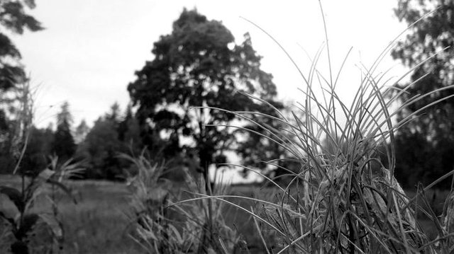
edited & resized, original by @markkujantunen
'Cause I like a more striking look -- a personal preference, of course. That may leave BW feeling a little bit cold, but to alleviate that one can add a tinsy bit of sepia tone, if willing.
For #2, B) is probably just better overall -- too much information is lost as the rust-oranges have barely translated to a different shade at all.
Thanks a lot! Your version IS better! You're going above and beyond what I was hoping for!
In fact, I think your suggestions will help me a great deal at making better B&W in the future!
I added contrast to the B&W photo. It made a huge difference. I've received similar advice before. In B&W contrast is king.
That core "crisp" feel. Postproduction has its uses!
There's one more thing I'm reminded of, although you may be less interested, but for 2B -- if you lower the color temperature a bit the greens become more vibrant (I overdid it a bit here, let's say, for effect):
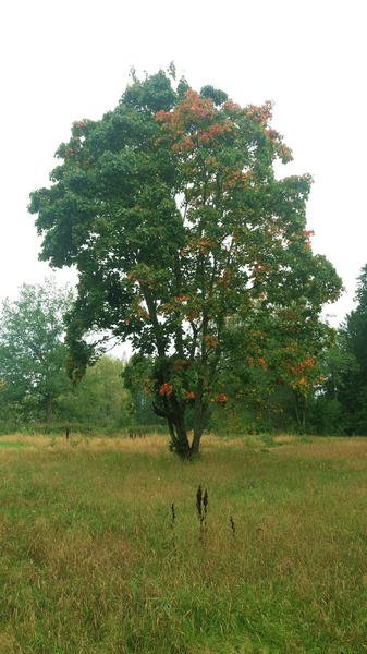
edited and resized, source by @markkujantunen
Overall, if color adjustment is useful to you, try sitting down to mess about with simple postpro tools -- I'm sure you'll find more uses for 'em.
I do edit them but not with tools that are any good. I plan to buy a DSLR this year. I'll probably start using Lightroom. My phone camera spits out jpegs which is not that great.