Effective Trading Strategy using Line Charts -Steemit Crypto Academy | S6W1 | Homework Post for @dilchamo
Glad to participate in new season of cryptoacademy that is back with new rules. Today I am writing homework task for professor @dilchamo on Effective Trading Strategy using Line charts.

Define Line charts in your own words and Identify the uses of Line charts.
Line chart is one of the various chart types used by traders for trading stocks, commodities, cryptos etc. It is basically the graphical representation of data in the form of discrete points joined together by line segments. In the context of trading, the discrete points represent the closing price of an asset over a specified period of time. To put it simply, we can say that line chart is the graphical representation of closing price of any asset under consideration over selected time period.
On the contrary, Japanese candlestick charts represent OHLC (open, high, low and closing price) of an asset for a specified period of time. Llne charts are very simple to interpret as compared to JC charts because only the closing prices are considered in line charts. Undoubtedly, Japanese candlestick charts are more informative then line charts and they give a complete idea of movement of price during a particular time frame. On the contrary , line charts do not give any information about the price of an asset during a specified period but they only give a discrete piece of information about an asset. In a way, we can say that line charts filter out the noise generated by the price movement.
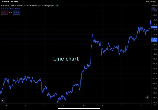
Line chart taken from trading view app
Uses of Line charts.
Line charts give clear information about the trend by filtering out the noise generated. It is therefore ideal to use them over large time frames.
Line charts can be used by traders to find some important levels like support, resistance and Stoploss etc.
Line charts are essential tools for traders that help them to take trading decisions like buy /sell signals etc.
How to Identify Support and Resistance levels using Line Charts (Demonstrate with screenshots)
Support and Resistance represent important price points or levels where price of an asset is supposed to bounce back to its original direction. These are potential areas where orders of particular type are consolidated to generate buying or selling pressure. Let's look at each of them individually.
Supporr represents price point or level where decreasing price of an asset is expected to pause and bounce back. Technically speaking, support of an asset represents price level with very high buying pressure or a level where large number of buy orders are consolidated that prevent further decline in the price of an asset and therefore results in bouncing back of a price.
Breaking of support by falling price of an asset is possible when there is very high selling pressure that matches all the orders placed at support level. So break out of a support level should immediately help a trader to understand a strong bearish momentum in the market and take trading position accordingly.
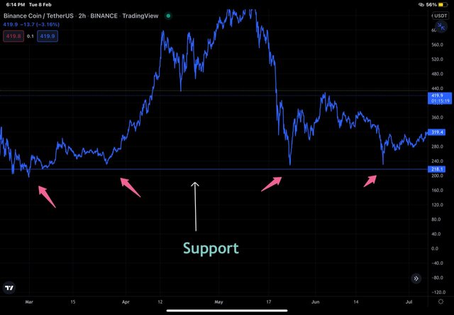
BNB/USDT chart showing support level tested multiple times as shown by arrows
On a line chart, Support level is obtained by joining swing lows of price movemmt. More the number of lows touching a particular price leve, more valid is that level or more strong is the support.
Resistance represents price point or level where increasing price of an asset is expected to pause and bounce back. Technically speaking, resistance of an asset represents price level with very high swlling pressure or a level where large number of sell orders are consolidated that prevent further increase in the price of an asset and therefore results in bouncing back of a price.
Breaking of resistance by increasing price of an asset is possible when there is very high buying pressure that matches all the orders placed at resistance level. So break out of resistance level should immediately help a trader to understand a strong bullish momentum in the market and take trading position accordingly.
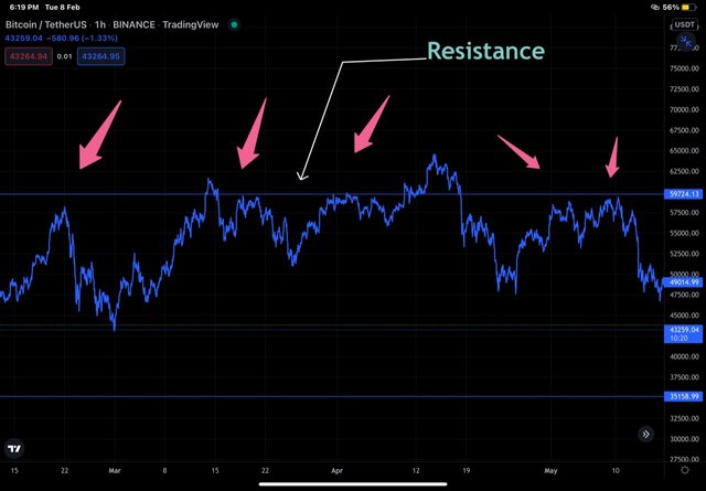
BTC/USDT chart showing resistance level tested multiple times as shown by arrows
On a chart, resistance level is obtained by joining together of swing highs. More the number of swing highs touching a resistance level, more valid or strong is the level .
Differentiate between line charts and Candlestick charts.( Demonstrate with screenshots)
Line charts are drawn by joining the closing price of an asset while as candlesticks represents open, high, close and low price of an asset. Line charts are therefore less informative than candlesticks.
Candlestick provide information about movement of price over a particular time frame like hugh Or low price in the form of wicks along with open and close. Line charts only represent closing prices.
Line charts filter out noise generated by price movement over a particular time frame by ignoring open, low and hugh price.
Line charts form well demarcated levels like support, resistance and Stoploaa level. Line charts indicate trends more cleanly over larger time frame than JC charts.

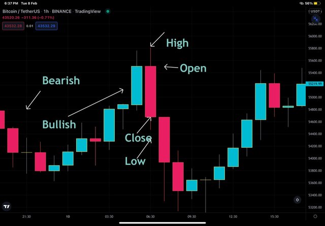
In the charts above, we can see that JC chart showing OHLC and colored differently where green candle represent bullish movement and red as bearish movement. On the corresponding line chart, no such Parameters are seen and clear cut trend is seen.
Explain the other Suitable indicators that can be used with Line charts.(Demonstrate with screenshots)
Use of indicatorindicators to supplement the information provided by the charts is a common practice followed by traders. Different indicators are meant to provide different information for which they have been developed. Scores of indicators can be used with JC charts but rhe use case is a bit restricted when it comes to line charts. For efficient use case of indicator with line charts, the method of calculation of indicators and line charts must synchronize which means that they must be considering similar factors. For example, indicators developed on the basis of closing price or average price tend to synchronize more with line charts than indicators developed on the basis of other price parameters.
Moving averages are the most suitable indicators that can be used with line charts. As moving average tend to average out the price, therefore moving average curves synchronize more with line charts. Moving averages act as important levels like support in bullish and resistance in bearish market.
As mentioned earlier, line charts are more relevant over larger time frames. Same holds true for moving averages too. Larger period moving averages are more valid in supplementing the data of line charts. Examples of moving averages on charts shall be shown in subsequent section.
RSI and Line Chart
RSI stands for relative strength index and is a versatile indicator that's widely used by traders to anticipate the reversals and take positions on the basis of overbought and oversold zones indicated by the arbitrary values of RSI.
RSI value below 30 indicates an oversold zone and is therefore perceived as buy signals by traders in wake of forthcoming bullish movement of the price . Similarly an arbitrary value of above 70 indicates overbought zone and is perceived as a sell signal by the traders in the wake of forthcoming bearish price rally.
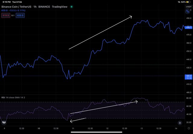
Prove your Understanding of Bullish and Bearish Trading opportunities using Line charts. (Demonstrate with screenshots)
Bullish and bearish trading opportunities can be spotted in the basis of price action study alone or in combination with indicators like moving averages, RSI etc. Example of price action include patterns like Ascending traingle, descending traingles Or other well studied patterns like flag and pole pattern, head and shoulder pattern, cup with handle etc. The more simpler price action studies include use of trendlines and rectangles etc.
Bullish opportunities .
Making use of moving averages either individually or in combination can be used to spot bullish opportunities. Use of single moving average (say 200 EMA) is helpful in a way that a trader has to look for crossover of price above MA. Such signal are particularly useful for swing traders.
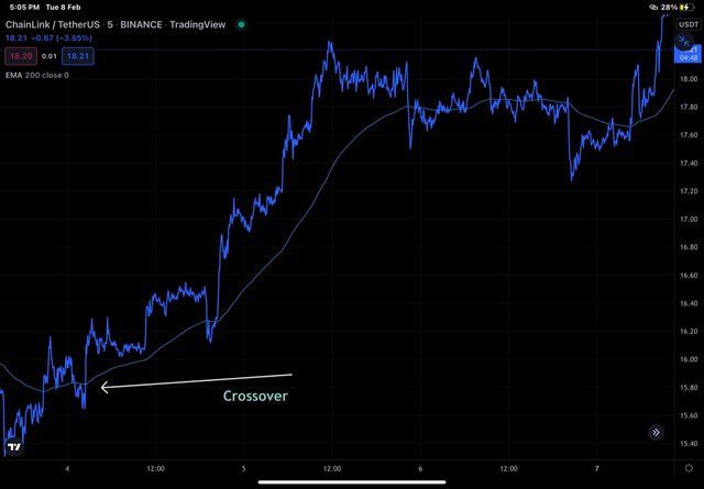
In the LINK/USDT chart above, we can see that crossover of price above 200 MA is followed by a bullish rally of price that can be materialized.
Combination of MA like 20 and 50 can be used spot bullish opportunities by looking at crossover of MA 20 above 50MA . This golden cross can be seen to yield bullish rally of price.
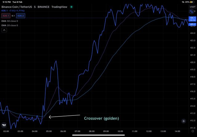
In the BNB/USDT chart above, we can see that golden cross ( 20 EMA above 50 EMA) is followed by bullish movement of price that can be materialised.
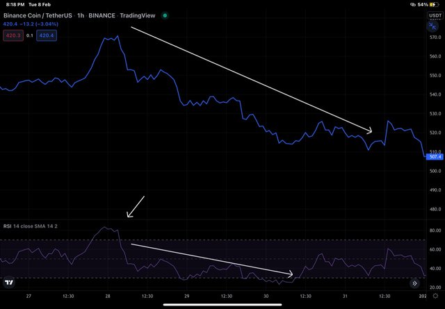
Bearish opportunities .
Use of single moving average (say 200 EMA) is helpful in a way that a trader has to look for crossover of price below MA. Such signal are particularly useful for swing traders.
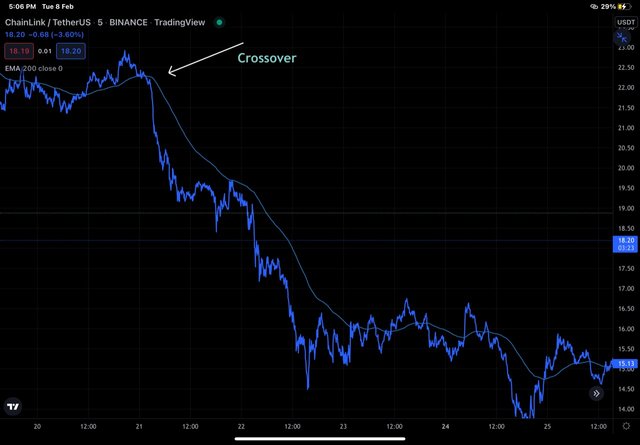
In the LINK/USDT chart above, we can see that crossover of price below 200 MA is followed by a bearish rally of price that can be materialized.
Combination of MA like 20 and 50 can be used spot bearish opportunities by looking at crossover of MA 20 above 50MA . This death cross can be seen to yield bearish rally of price.
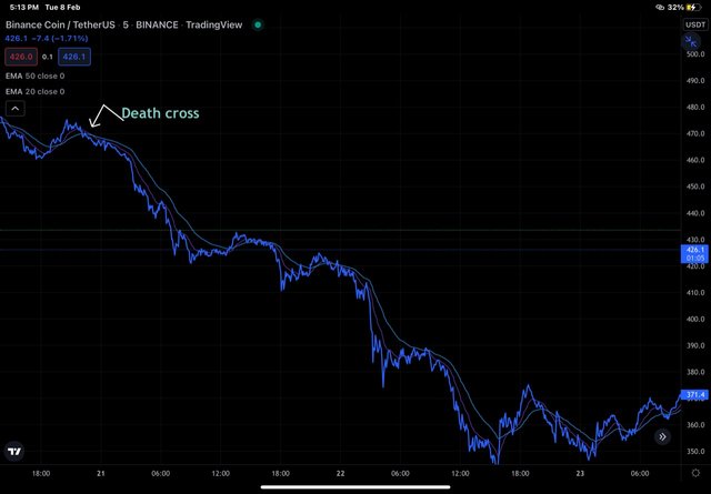
In the BNB/USDT chart above, we can see that golden cross ( 50 EMA above 20 EMA) is followed by bearish movement of price that can be materialised
Investigate the Advantages and Disadvantages of Line charts according to your Knowledge.
Advantages of Line Charts.
Line charts are simple to understand.
Line charts provide a good visual insight of trend even without looking into miner details.
Line charts filter out noise generated due to price movemmt during a selected time frame.
Line charts provide clear cut levels of support, resistance and Stoploss.
Disadvantages of Line charts.
Line charts are less informative as they only take into account the closing price. Movement of price during a time period before closing is ignored.
Line charts are not suitable over smaller time frames.
Some vital information like gapping up or down of price can't be seen on line chart.
Conclusion.
Line charts are one of the basic and simple chart types formed by joining the closing prices of asset . These chart patterns are simple to understand and give a clear visual insight into trend especially over longer time frames. Although less informative than JC charts but trading opportunities can be spotted easily by traders for their benefit.
All the best to your homework tasks, hope you have done extremely good