Signature Template Using Images, What Do You Think??? - A Bitmoji & Canva Creation

I have been wanting to do this forever!!! Design a nice custom signature template that is still fully customizable and will not break when viewed through @Partiko.... as was my previous idea using logos and frames did not work out.... so I fired up Canva and searched for a few classes on Skillshare 👌
Found a few good classes on SkillShare and pulled the details I wanted about style and layout then went searching for a template I could use on Canva. Decided to start with an info graphic that had nearly the layout I wanted just needed to add to it.
After having worked out a style I liked and realizing it wouldn’t work with broken images I decided to start again from scratch 🤦♂️
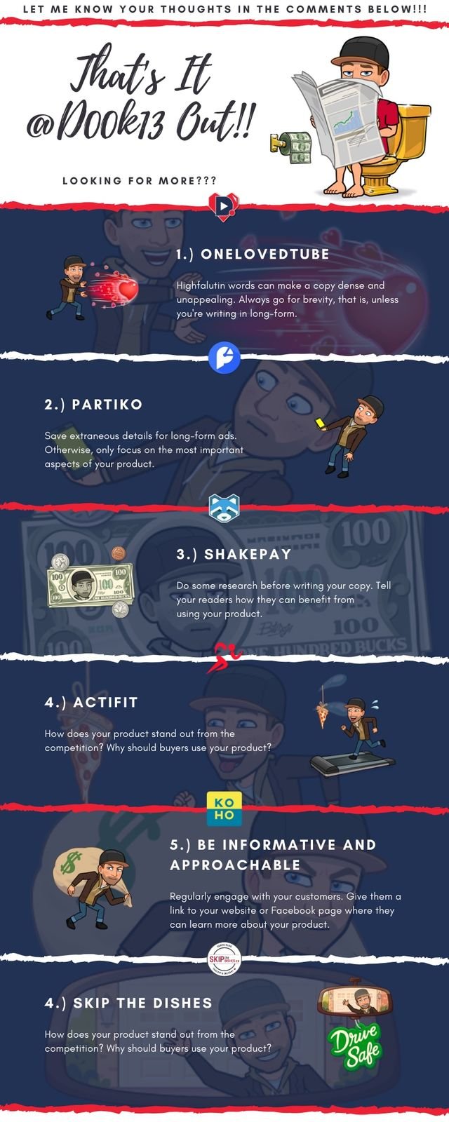
As you can see it would disrupt the image no matter how I try to break it up, there will be white gaps in the image, so my simple solution was to create individual custom size cards 1500x500pcx.
Shooting for a similar style and layout I had to insert frames and text for both a left and right aligned card then simply duplicate and add images then finalize text write ups.
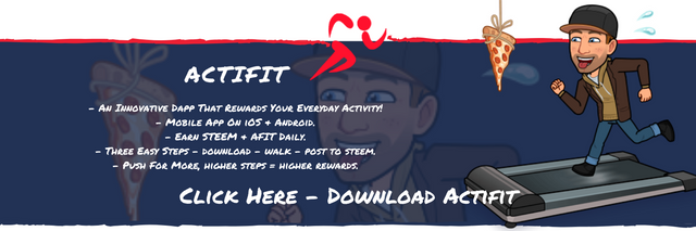
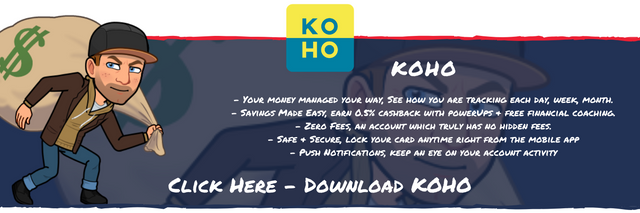
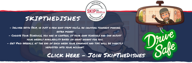
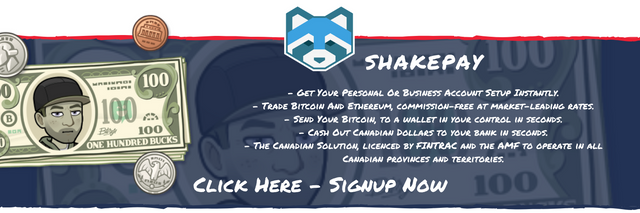
It was a little bit finicky getting the blended background with blue background while keeping the torn paper edges. I ended up with double square frames over top each other with blue at the back and 20% transparency on the front with a Bitmoji insert. Edge to edge so it’s obviously separate from what’s above and below.
Used a ripped paper line in red on the top to mark a new section and blue at the bottom to have an organic ending feeling. Needed to break the line for the @Actifit card so I used the ends of two lines.
Used the same Bitmoji as avatar image and a background image for each card trying to add some flare while also pulling in the cartoonish theme. Images are directed towards the text to draw the eyes in towards the details. Top of Bitmoji laid over page break adding an “acting on top of the page” type feeling.
Used logos as top center image to mark each section and also blend the ripped page break slightly.
Pretty simple text, permanent marker font using white over the dark background and black over the white background.
How did it turn out? You Tell Me!!!

Posted using Partiko iOS
Thank you so much for participating in the Partiko Delegation Plan Round 1! We really appreciate your support! As part of the delegation benefits, we just gave you a 14.91% upvote! Together, let’s change the world!