Steem Observatory update - Responsive design, better mobile support
Time for another Steem Observatory update!
New features:
If you don’t see the new features, hit the refresh button in your browser when you’re on Steem Observatory, it might still have the old version cached.
Responsive design
When you resize the window and it gets smaller than 800 pixels wide, the app doesn’t show a split view anymore with the posts on the left and the votes on the right. Instead, it shows only the votes and a back arrow is displayed in the top left to go back to the posts list.
When you resize the window even further until it’s smaller than 500 pixels, the padding is removed so that the maximum amount of space is used.
.png)
Mobile
The responsive design and other changes I made now make the app work a lot better on smartphones. There are still a few things I’ll do to improve it, but it’s a start ;)
On Google Chrome for Android there is a display bug (payout text below the post titles gets squashed together) when you have Auto refresh turned on that I couldn’t figure out yet, so if you use Google Chrome on your phone and run into this issue, manually refresh for now instead of using Auto refresh. You can just pull down the post list to refresh on Chrome, which might be better suited than Auto refresh for a phone anyhow.
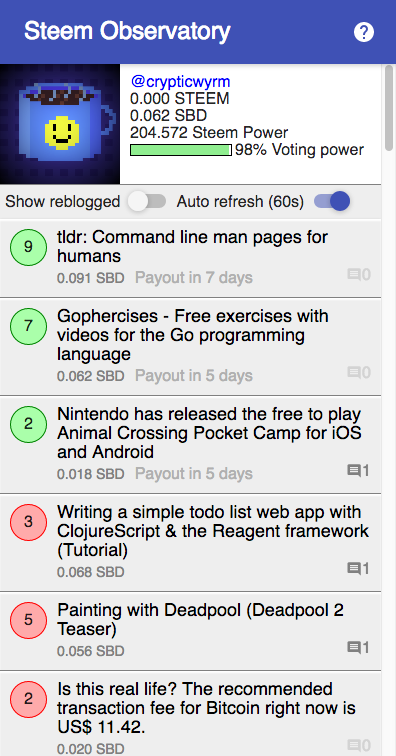
Replies
The number of replies a post has received is now displayed. The number and speech bubble icon is barely visible when there are no replies yet, so you can see quickly at a glance if one of your posts has received a comment since the last time you looked.
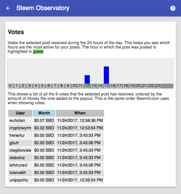
Post creation hour highlighted in chart
The hour a post was posted in is now highlighted in green in the posts per hour bar chart, as you might have already seen in the screenshot ;)