Color Rendering: A Hurdle in Illustrating
Merry Christmas everyone, how is this beautiful community of wonderful people doing? I missed this community for a while and felt a little Steem sick, if you know what I mean. Recently I had been involved to some projects that ate most of my time. I can’t talk much about the project since it is confidential but most that I do there is designing and drawing.
Somehow it crossed into my head the years that I had spent studying and learning illustrating and designing while I was working. Before I sleep, my thought keeps on remembering the things that I struggled to, the people that I met along the way, the hurdles that I overcame and the small joy that I feel whenever I had this small achievements that became large in time.
That’s so much dingle dangle talk for the first two paragraphs but at least you should know that this post isn’t all about me. This post is about coloring concepts and some tricks that could help the people who will have the time to read this article. I really hope that this post helps…
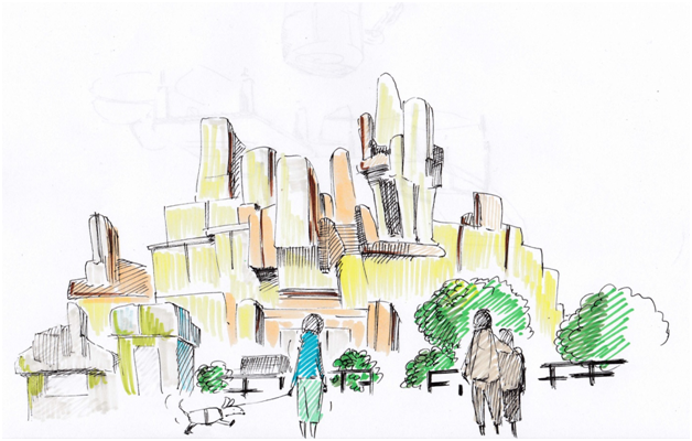
this illustration is my work
Basic Basic Basic, A Colorful Aspect on Ones Illustrations
Color is an important part of an illustration, since anything around you unless you’re blind has a color. Even a comic strip that is drawn with just pen and ink has two colors at least, the black and the white thus the use of the two colors are maximized for best result and to make the illustration as effective as possible with the use of line arts.
In designing interiors and exteriors of a building, color is a huge thing to consider. The color could affect things like space, temperature and elegance in a psychological approach.
The safest color for a room either it is the exterior wall or the interior wall is white. For the furniture natural brown or natural black(if the tree the wood was harvested from is black) with the glossiness of thin varnish is the most practical choice. In the world of architecture, wood is the most elegant material for almost anything. From stair case, window frames, doors, to furniture and antique wall clocks. The color of natural brown not only looks elegant but also has the powerful but welcoming feel to it.
Colors like cream, yellow, dirty white and other such hue could be an effective choice but you should always consider the effects that it may do to the room that you are using these colors to.
Yellow could make a small room look a little spacier and the use of cream could give the people who looks at the color go sleepy. Yes, there are colors that can psychologically affect you by just looking at them.
For bedrooms, especially if the room is for toddlers, colors like pink and blue would be effective as long as the value of blue or pink is on a decent tone.

generated this colors with photoshop
I had provided some samples of good tone choices above. As you can see above, the tone of the two colors aren’t that bright neither too dark. I feel that I can still arrange the tones for the blue and pink a little brighter if I wanted to but not darker.

colors generated with Photoshop
Now here is a bad sample for an interior of a normal house bedroom. The tones are too bright and feels a little irritating. These colors could be effectively used for some establishments like an ice cream or candy parlor. Yeah, a candy specialty store like the store that had opened just recently here in a mall nearby. The color scheme of that store’s interior has this range of brightness in colors. For that application, I find it effective because these colors are attractive and eye catching since they are the only store/boutique that used such bright tones for their interior.
I think I already gave some good samples here so far for picking colors. Having the sense of picking the right color takes some practice and research, with some examples that I gave I think somehow you can grasp some concepts here of why and when is a color used.
If you still want to read more examples of practical color application, don’t worry, this post isn’t over yet.
Oh yeah, just a short comment here, the latest color scheme of our platform, Steemit.com, the pale green color… It sucks big time. It doesn’t look attractive and professional. Just being honest here, I love this platform.
Contrast and Compliment
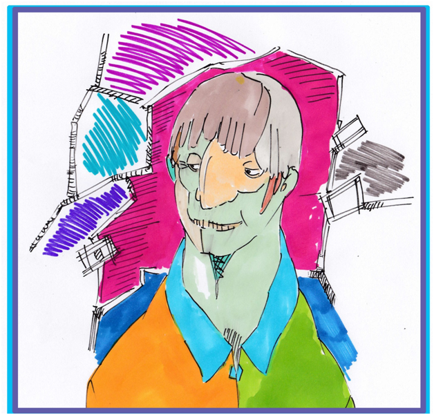
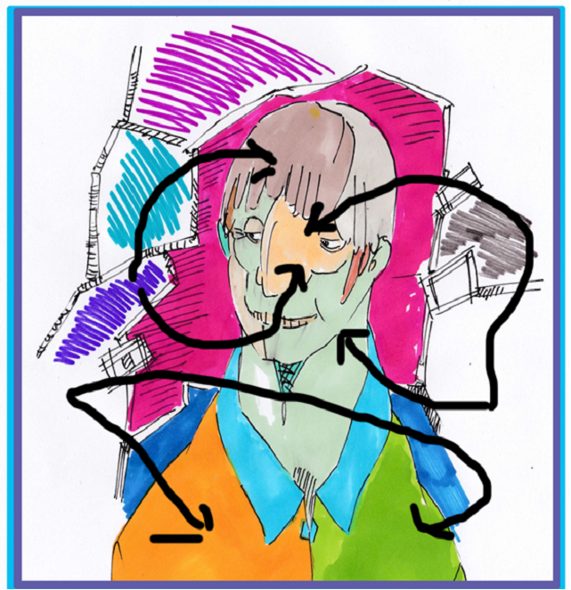
this illustration is my work
And of course, when you design or illustrate either it is for a professional field like a product design or entertainment like a character design, most likely you will have more than one color to choose. There is this type of combinations that we use when we consider colors. Picking two combinations to either compliment or contrast colors is also important, it gives the edge to the visuals in overall.
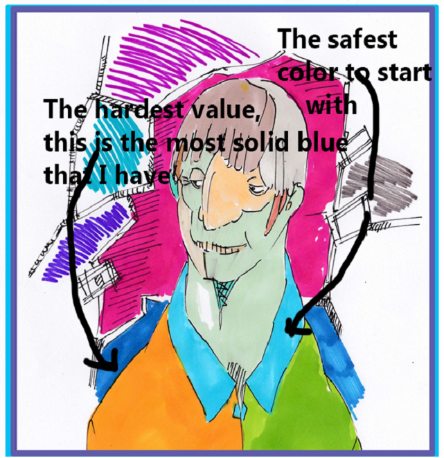
I made a small illustration and colored it with some colorful markers (the drawing above). Practicing coloring with markers is a good practice since markers are kind of tricky to pull off especially when you haven’t tried them before.
Coloring from a big range of colors with a lot of values per color is a challenge for markers. Colors with too solid color into it is hard to handle, thus it gives you greater risks into making that illustration a failure.
Starting from lightest and overlapping to darker tone is the best way to gauge the colors around with markers. Sometimes I highlight some parts for that flair effect with a white water color pencil or a liquid eraser (correction fluid) white water color pencils work really good as a compliment medium for markers especially those Prisma color brand water color pencils.
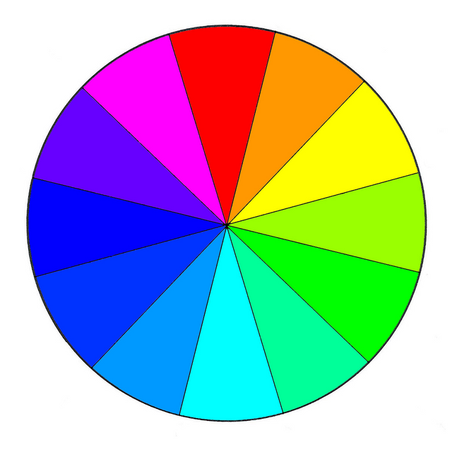
picture has been borrowed from Google
For an individual to have the foundation of knowing what is a compliment or the contrast of a color, one must study the color wheel. The color wheel is simple to understand, if you want a contrast of a certain color, just look at the color wheel and look at the opposite side of the color that you want to have a contrast color to be with. Let us have a sample here, let us say the chosen color is blue, thus in the color wheel the color yellow green is on the opposite side of the blue color then that makes that color the contrast of blue.
For picking the compliment color, just look at the colors next to the chosen color, at this case the colors purple and another variety of blue are the compliments of blue. Easy ,right?
But most of the time I don’t rely on the wheel anymore, I just look at the colors that I like and then have that feel that this color will work with this one and this color will not. Just look at how did I colored that mosaic wanna be illustration that I made above again. Sienna and cool gray are colors that are not in the color wheel but the two works good together, you know why? Because gray, either a dark or light gray is a neutral color which means that it can work with almost any color.
Now look at the brown and the sienna, of course they should work together fine because both colors are from the same origin of colors. Brown and sienna are from the combined colors of black and orange only the two having different values.
What about green and orange? I don’t know how to explain this two but I find that the neon like value of these two colors complement each other. In art, things like standards and principles are things that makes sense but most of the time those things that just have the sense wins everything.
End
Well, there is nothing much more to say here, hope you guys enjoyed this post. In the end, becoming good in designing and drawing takes a lot of time and practice. There are no short cuts, there are no formulas, so just work on it fam.
Here is a short video from Kelly Eddington Watercolors Channel, visit her and subscribe to her.
Great work, you really should post some more like this. It's great for those struggling with colors.