Crypto Academy Season 4 Week 1 Homework Post for prof. @sapwood : Onchain Metrics
Hello everybody,
I am really excited for season 4 of Steemit Crypto Academy in the anticipation that there will be ample opportunity for learning about the crypto world.
Here I am submitting my 1st assignment of season 4 on Onchain Metrics.
(1) What is a HODL wave, how do you calculate the age of a coin(BTC, LTC) in a UTXO accounting structure? How do you interpret a HODL wave in Bull cycles?
HODL wave
As we all know HODL is a misspell of HOLD and in crypto and any other asset trading/ investment it refers to holding of that asset. Here HODL wave in crypto is a common pattern observed after the rally. A HODL wave is created when during a rally a large amount of transaction happens till the peak and later that BTC UTXO remains a hold/stable in a particular wallet of its new owner and ages there for different time band viz 1-2 years, 2-3 years, 3-5 years and so on.
Calculation of the age of a coin
The age of the coin is not calculated from its mining date and time, it is calculated by UTXO accounting. UTXO stands for Unspent Transaction Output. UTXO is the smallest amount that can not be further divided and it is an indivisible part of any native token.
For BTC when it is moved from one wallet to another a new UTXO is created by the network. The age of UTXO indicates that when last time the said BTC was moved.
Interpretation of HODL wave
Till now in the history of Bitcoin, three major HODL waves are observed.
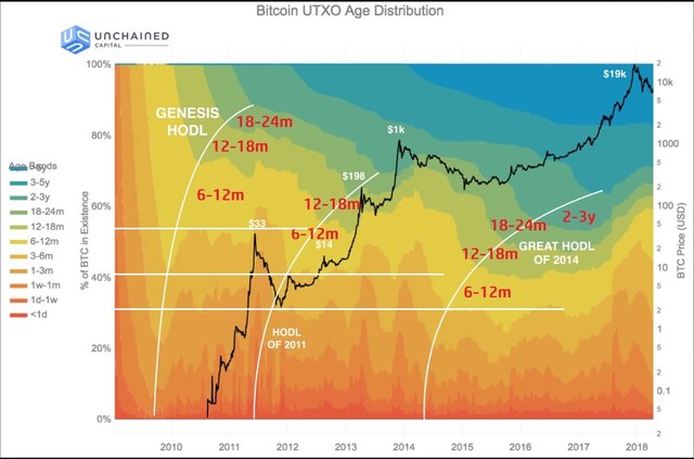
- The Genesis HODL wave
- The HODL wave of 2011
- The Great HODL wave of 2014
Unlike other waves, The Genesis HODL wave was not due to a rally but there was no option of selling Bitcoin in the absence of any exchange till mid-2010, due to that miners were accumulating and holding Bitcoin. After trading of BTC started in 2011 BTC ages 1-2 years decreases. In this wave, more than 50% of BTC was aged 6-12m and above. (Indicated by the white line in the graph above)
The second HODL wave was observed in 2011. After launching some crypto exchanges in 2010 and 2011 Bitcoin moved from 0 to $33 in the mid of 2011. After this rally is over, it took almost 2 years to cross $33. During that phase, BTC was ageing in the wallets of its new owners and this was known as The HODL wave of 2011. Unlike the genesis wave which was the wave of miners, it was the wave of investors. In this wave more than 60% BTC was aged 6-12m and above. (Indicated by the white line in the graph above)
The Great HODL wave of 2014 was observed after the BTC rallied to the $1000 mark. After touching $ 1000 in December 2013, it took more than 3 years to cross the 1000 $ mark in Feb 2017. These three years are known as The Great HODL wave of 2014. In this wave about 70% BTC was aged 6-12m and above. (Indicated by the white line in the graph above)
During the HODL wave, a large no of coins is held by investors so the supply in the market reduces which leads to an increase in the price.

(2) Consider the on-chain metrics-- Daily Active Addresses, Transaction Volume, NVT, Exchange Flow Balance & Supply on Exchanges as a percentage of Total Supply, etc, from any reliable source(Santiment, Coinmetrics, etc), and create a fundamental analysis model for any crypto[create a model for both short-term(up to 3 months) & long-term(more than a year) & compare] and determine the price trend (or correlate the data with the price trend)w.r.t. the on-chain metrics? Examples/Analysis/Screenshot?
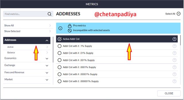
For Onchain Metrics analysis here I am using the CoinMetrics.io website.
- Landed on CoinMetrics.io
- Clicked on Chart section then Network Data

- Created a new chart layout name and selected ETH for analysis.

(1)Daily Active Addresses
- For Daily Active addresses analysis clicked on Metrics then >> Addresses>>Active Addr Cnt
Short term (3 months) analysis of Active address v/s the price of ETH
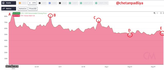
| Point | Date | Active addresses | Price in USD |
|---|---|---|---|
| A | 5-6-21 | 829.614 k | 2604.971 |
| B | 28-6-21 | 821.105 k | 2079.278 |
| C | 27-7-21 | 734.086 k | 2286.229 |
| D | 15-8-21 | 490.026 k | 3310.727 |
| E | 4-9-21 | 520.029 k | 3886.230 |
From the above chart, we can see that -
- From A to B there is a drop of about 1% of active addresses and a price drop is about 20%
- From B to C there is a drop of about 10% of active addresses but the price increases about 10%
- From C to D there is a drop of about 33% of active addresses but the price increases about 44%
- From D to E there is a rise of about 6% of active addresses and price also raised about 17%
Overall if we analyse from A to E (3 months) active addresses dropped about 37% but there was an increase in price about 50%
Long term (2 years) analysis of Active address v/s the price of ETH
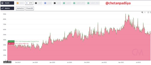
In the long term chart of ETH, if we consider the highest and the lowest active address, the price also increases with the increase of active address. On 6-Aug-19 Active addresses were about 346k and the price was at 225$, on 3rd Sep 21 Active addresses increased to 512k(48%) and the price rose to 3981(1670%).
During the correction phase from 5th May to 19th July, the price dropped from 4115$ to 1822$ and no of active addresses were also dropped from 868k to 583k
Conclusion - In the short term increase or decrease of active address does not much influence the price movement but in the long term as the participation increases(an increase of active address) price also increases.
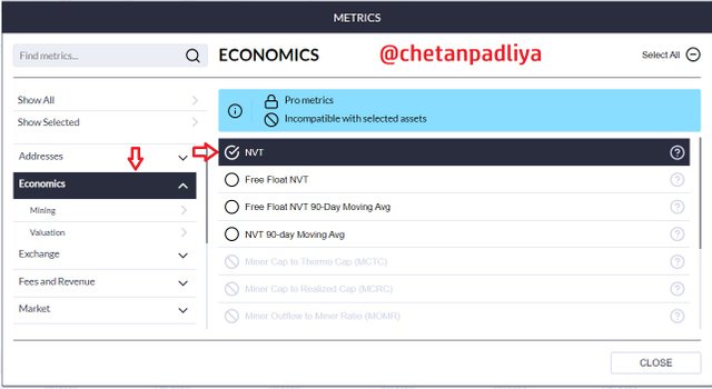
(2) NVT
Set up of NVT on chart Metrics>>Economics>>NVT
NVT stands for Network Value to Transaction volume, It shows the relationship between transfer volume and market capitalization of the asset. It is also known as PE ratio.
NVT = Market cap/Transaction volume of any particular day.
Higher the NVT is considered the asset is overvalued while the lower value of NVT indicates that added is undervalued. NVT is a good indicator for revealing speculative value and possible bubbles. It can be used to differentiate between a dip and a reversal after the peak
Increasing NVT value indicates that network value is increasing more as compare to transaction volume and it may lead to a price bubble. Sometimes it also measures actual network growth. It indicates asset is overvalued.
Decreasing NVT value indicates that despite increasing transaction volume network value is lagging behind. It shows asset is undervalued.
NVT is not useful to detect market crashes in advance but can be used to discover the crash or consolidation phase after the peak.
NVT analysis on short term chart(3 months)
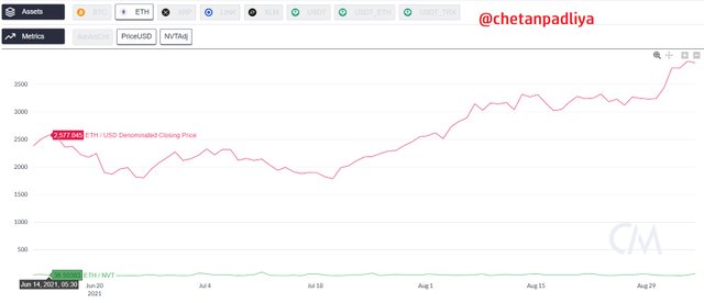
In the above chart, we can see that at peak on June 14 price of ETH is 2577, NVT is 36 and it is corrected after that up to 1785 on 20th July NVT dropped to 30.
NVT analysis on long term chart(2 years)
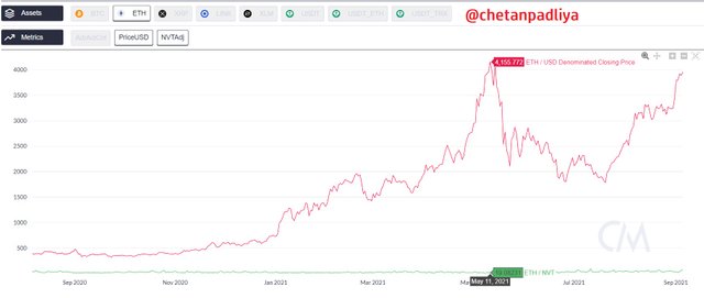
NVT for ETH in the last 2 years varies from 10-150. It was high initially but decreasing slowly as the transaction volume is increasing. In the earlier phase, the price of ETH was about 200 and NVT was about 50 but in recent times when the price of ETH was at an all-time high (about 4160) on 11th May, 21 NVT dropped to about 19 it means the market capital increased manifold and volume was also increased more.
(3) Exchange outflow Native Unit
How many units of any coin is deposited or withdrawn from the exchange also show a significant relationship with price movement.
Short term analysis of Exchange outflow Native Unit on3 months chart
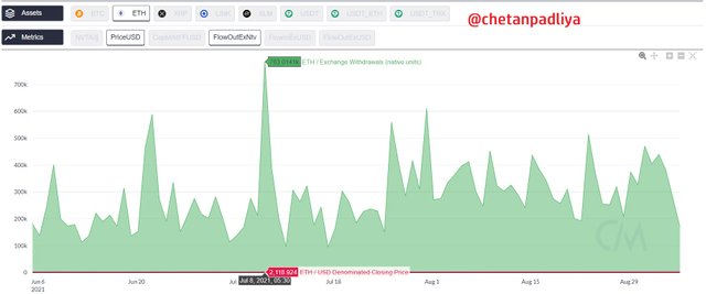
In the above chart, I analyse some peaks and dips to correlate net outflow and price changes.
In short term on 8th July, 783k was withdrawn from the exchange and the price was about 2118 $ but in the next couple of days on 11th July outflow was decreased to 94k but the price remains almost constant at 2140.
If we analyse it for one month on 8th August net outflow from the exchange was 242k units but the price was about 3027 $.
Long term analysis of Exchange outflow Native Unit on2 years chart
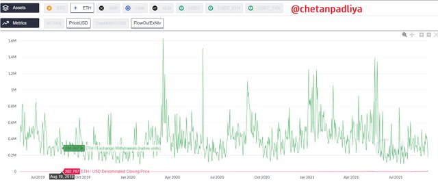
In long term, I analyze the price movement of ETH from about $200 (19 Aug 2020) to $1000 (Jan 4 2021) Native unit withdrawal was increased to 1.24m from 286k. Price movement increases with the flow of units on exchange increases.
(4) Netflow of the asset on exchange in USD value.
3 months chart analysis
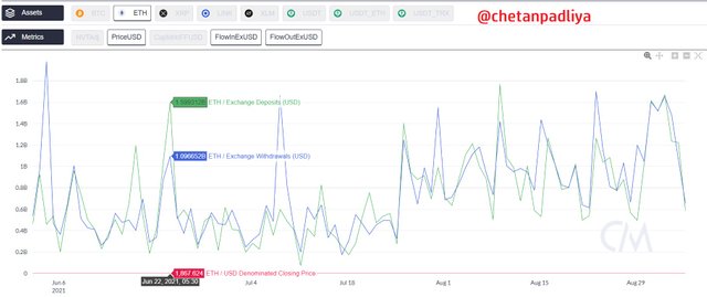
In a short period on 22nd June, ETH was at 1867 with a net flow of about +0.5B $ worth of ETH and on 8th July ETH was at 2118 $ with a net flow of about - 1B $ worth of ETH. It shows that heavy outflow from the exchange increased the price of the asset.
2 years chart analysis
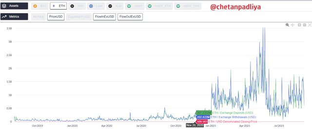
If we analyse the journey of ETH from about 500 to 4000$ on 20th Nov +100m to 3rd Sep -0.24B, it is clear that as the activities on the exchanges increases it reflect in price uptrend.
Transaction Volume
No data available on Coin Matrics
Exchange Flow Balance
No data available on Coin Matrics
Supply on Exchanges as a percentage of Total Supply
No data available on Coin Matrics
(3) Are the on-chain metrics that you have chosen helpful for short-term or medium-term or long term(or all)? Are they explicit w.r.t price action? What are its limitations? Examples/Screenshot?
I chose ETH for onchain metrics analysis. Analysing the daily active address doesn't give a clear picture of price movement on the short term chart (3 months). Comparatively on the long term chart (2 years) price movement is related to the daily active address.
NVT indicator does not represent a clear picture in short term and should be used for long term analysis. It should not be used to predict the price movement but can be used to determine either at the current price the asset is underpriced or overpriced. The basis on that any strategy can be made.
For exchange net flow of assets is also not clearly co-related with price movement but in long term somewhat it can be correlated with price movement.
On chain metrics is a new concept exclusively developed for the cryptocurrency market as long historical data is available publically. It is a fundamental analysis useful in the long term to identify undervalued and overvalued crypto assets.
Limitations
In NVT value market capitalization is used for calculation but unlike the stock price, it can be manipulated easily for low volume coins. E.g a token can be created with a circulation supply of trillions and few coins traded on high value will show the false market cap.
Not all onchain metrics are helpful to co-relate with price movement. Main onchain metrics like Active address and transaction volume are usually co-related with price movement.
Crypto space is just a decade old and most of the crypto asset is not old enough to fit in the onchain metrics analysis, as it is reliable only on the basis of long term data.
Onchain analysis has no or little value to short term traders or scalpers, as these metrics usually produce signals for longer-term market cycles.
Obtaining onchain data is also a challenging task. If you are a professional must have a node of the blockchain for faster processing of the data and alternatively, you have to depend on various third party service providers like CoinMetrics, Look Into Bitcoin, Sentiment etc. Most of their analytical tools are paid.
Conclusion
Onchain metrics is exclusively developed for crypto assets. It is a fundamental analysis rather than speculative and generated signals generally on long term data inputs. Currently, not all crypto assets are eligible for on-chain metrics analysis so only limited coins like BTC, ETH LTC can be analyzed reliably using onchain metrics.
As the industry will mature with time Onchain metrics would be more beneficial for investors and traders.
Thank you, prof. @sapwood for delivering such an informative and interesting lecture.


You have been upvoted by @sapwood, a Country Representative from INDIA. We are voting with the Steemit Community Curator @steemcurator07 account to support the newcomers coming into Steemit.
Engagement is essential to foster a sense of community. Therefore we would request our members to visit each other's posts and make insightful comments.
Thank you
Well experienced every point. Onchain matrics will help a lot in up coming years.
Your Post has been manually Supported/Up-voted by @steemingdiaries which is a Community & Curation account for Steeming Diaries Community.
Comments, Votes are performed an important role for Community, hence involved with your innovative Comments & Votes on other active users posts.
Community Latest Update: Steeming Diaries CONTEST Of The Month (September 2021) | Steemit FAQ