Graphic Design Class 3 - Colour and Typograpghy. | by @chairulrizalx
Good evening all friends, meet me again @chairulrizalx and this time I will take a Graphic Design Class in the Steem Skillshare Community mentored by @atim1234. In this third class, I will learn about the Basics of Graphic Design and the Introduction of Colour and Typograpghy, this time the task is tutored by @lhorgic. Hopefully, this lesson will be useful for all of us in this community.

1). In your own word, explain what you understand by Colour & Typography ?
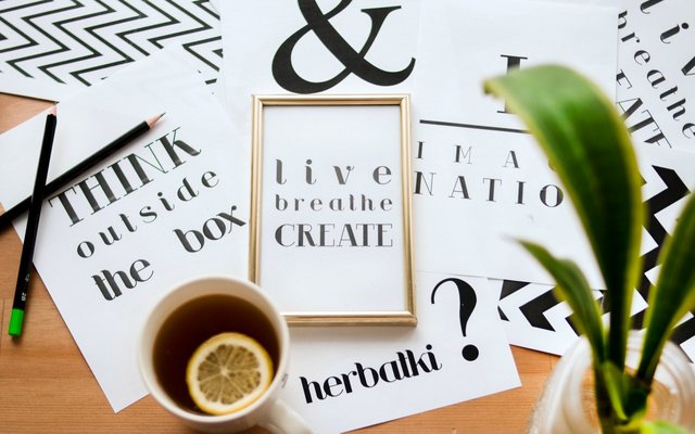
Typography
Graphic Design is a field of art that contains many techniques and elements, which makes graphic design a free thing to express oneself. In this post, I will discuss one of the important elements in graphic design, namely "Typography".
 source
The typography created by each designer must contain different elements or purposes, even though the core message to be conveyed is the same. We can find typography in everyday life such as promotional designs on social media, poster designs, flyers, banners, and the like which are a form of visual communication whose function is as a medium to convey information.
 source
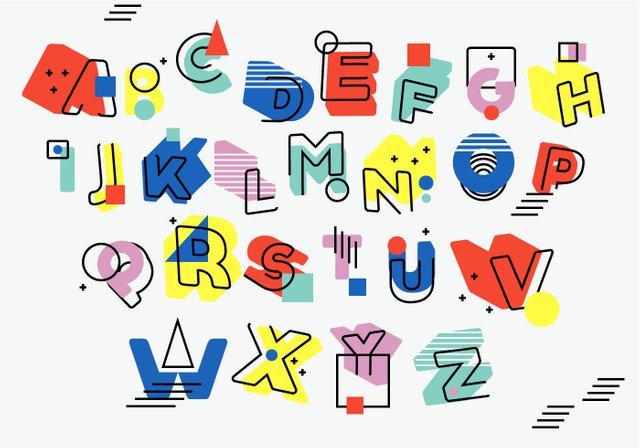
Typography is divided into several categories:
- San Serif
- Script
- Serif
Here I will share tips on using typographic design techniques for designers:
- Set the type of text to be used.
 source
- The right color choice according to the design.
 source
- Follow design trends to stay up-to-date.
 source
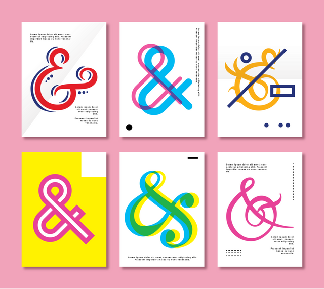
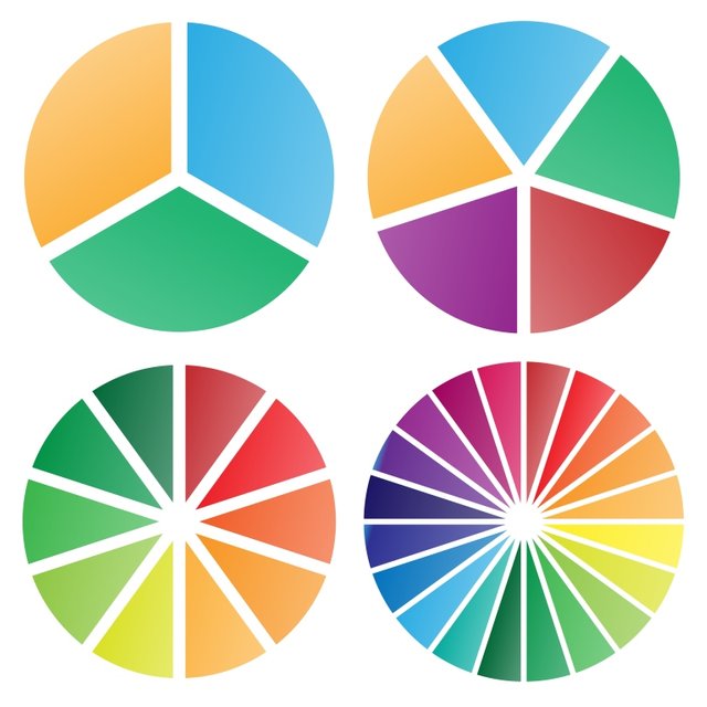
Colour
 source
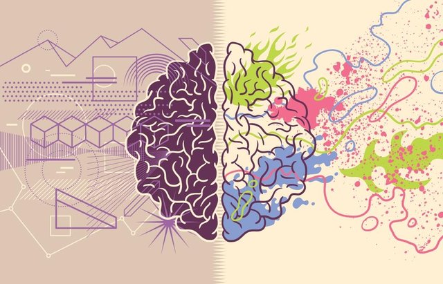 source
The following are the criteria for choosing colors in the design:
- Show color with the dark background.
- Choose a bright color for the foreground.
- Avoid using brown and green for the background.
- Use colors as needed.
- Use color to grab the attention of the audience.
- Avoid using a lot of contrasting colors in one design.
2). Mention 5 colours and what they represent just like you were taught in this class ?
1. Purple
 source
2. Gold
 source
3. Black
 source
4. Gray
 source
5. Pink
 source
3). Research 3 more fonts each for the following font categories
1. Script
- Italianno
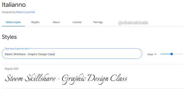 source
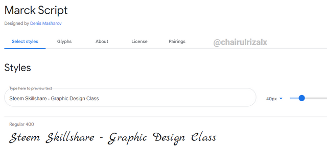
- Marck Script
 source
- Style Script
 source
2. Serif
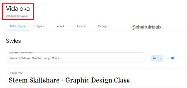
- Vidaloka
 source
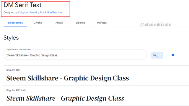
- DM Serif Text
 source
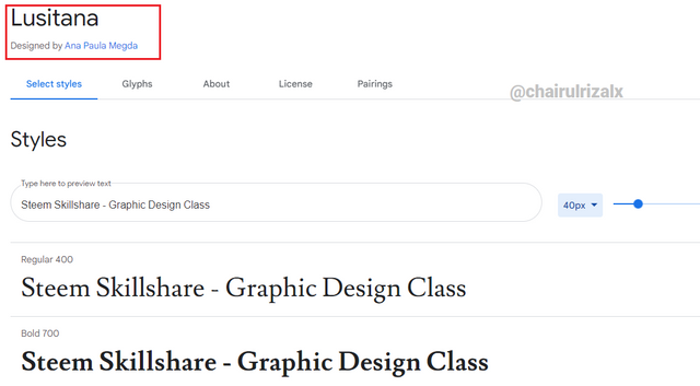
- Lusitana
 source
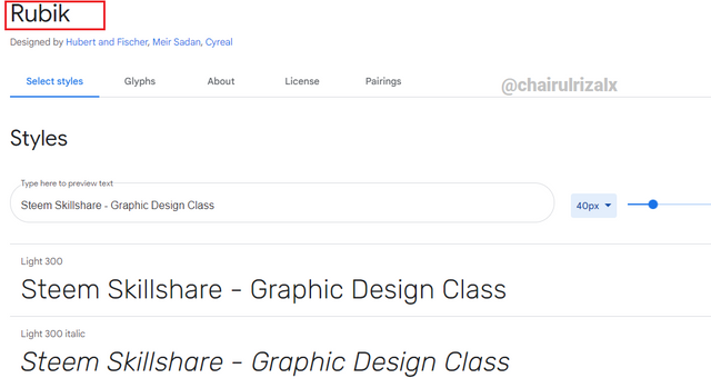
3. San Serif
- Rubik
 source
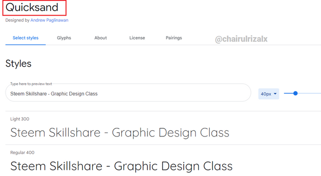
- Quicksand
source
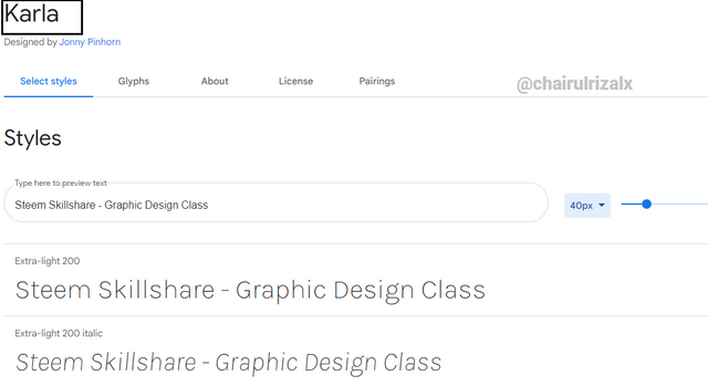
- Karla
 source
4). Create a simple design showing your understanding about this lesson.
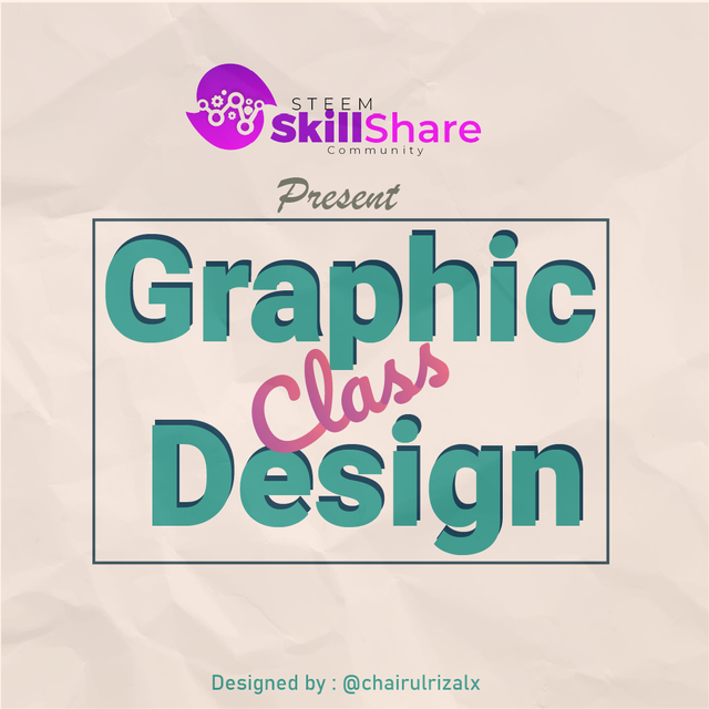
Here is the result of a Typography design that I made with the Adobe illustrator CC 2017 application. Here it uses several colors, namely:
- # 264653
- # 2a9d8f
- # fff1e6 and additional
- color gradations # b24592 + # f15f79.
The fonts I use are Roboto Black, Brush Script MT Italic and Pacifio Regular. For a final touch I added a crumpled paper texture that I downloaded from the Vecteezy source website under a free license.
The design process that I did can be seen in the image below:
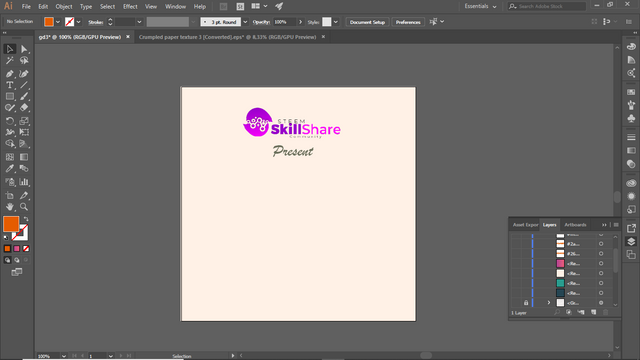
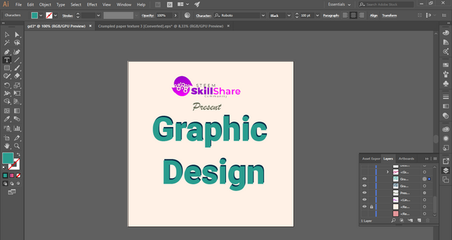
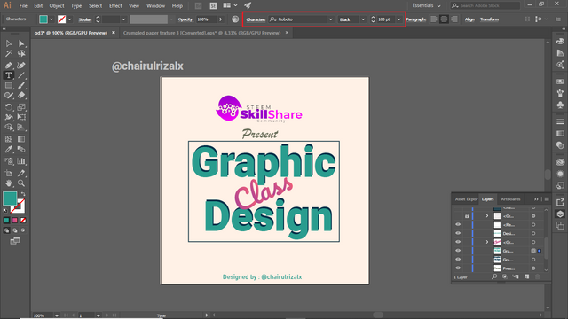
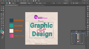
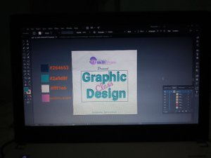
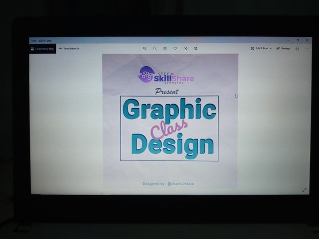 Photo that I took using a smartphone while in the design process.
Graphic design is one way to keep your mind positive and creative, because positive thoughts will produce creative and innovative ideas which will be very useful when designing
Thank You
cc : @milakz @daytona475 @arie.steem @steem.skillshare @papi.mati @slon21veka @dwarrilow2002 @jenesa @atim1234 @printskill @niglys8 @lhorgic
cc : @milakz @daytona475 @arie.steem @steem.skillshare @papi.mati @slon21veka @dwarrilow2002 @jenesa @atim1234 @printskill @niglys8 @lhorgic
Good job dear student...you assignment is very comprehensive. I observed you used center Alignment for question 4 which is cool. Kudos. Keep exploring and don't limit yourself.