INCLUDE EDIT ICON/OPTION WITH READ/REVIEW MODE. READ WHY THIS IS NECESSARY
Components
One thing I noticed while using Oi notepad is that the option to edit notes is granted automatically on opening a note. Whether the user just want to study or review the note, they have to deal with keyboard popping up each time the screen is touched. So the need to always be conscious while reading from Oi notepad is mandatory. This can be however, discomforting.
Proposal
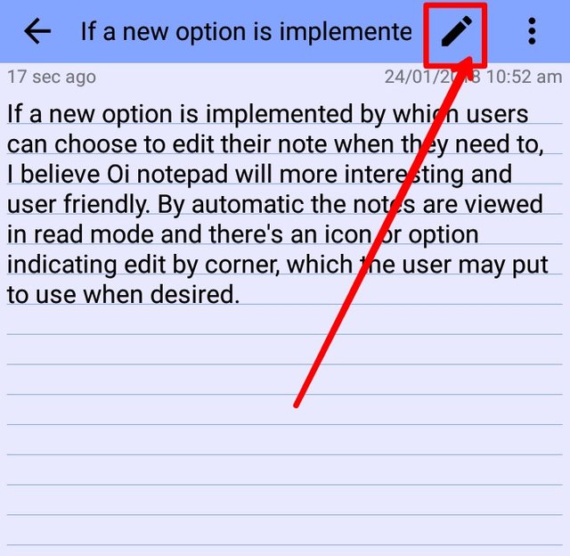
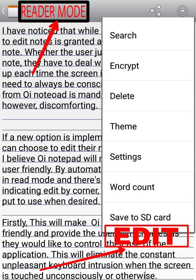
If a new option is implemented by which users can choose to edit their note only when they need to, I believe Oi notepad will more interesting and user friendly. By automatic and default the notes will be viewed in read/review mode and there will be an icon or option indicating edit by the corner, which the user may put to use when desired.
Mockups / Examples

*OI notepad edited to clarify the suggestion

Benefits
Firstly, This will make Oi notepad more user friendly and provide the user with choices as they would like to control their use of the application. This will eliminate the constant unpleasant keyboard intrusion when the screen is touched unconsciously or otherwise while reading through notes.
Posted on Utopian.io - Rewarding Open Source Contributors
Thank you for the contribution. It has been approved.
You can contact us on Discord.
[utopian-moderator]
Hey @bluishjane I am @utopian-io. I have just upvoted you!
Achievements
Suggestions
Get Noticed!
Community-Driven Witness!
I am the first and only Steem Community-Driven Witness. Participate on Discord. Lets GROW TOGETHER!
Up-vote this comment to grow my power and help Open Source contributions like this one. Want to chat? Join me on Discord https://discord.gg/Pc8HG9x