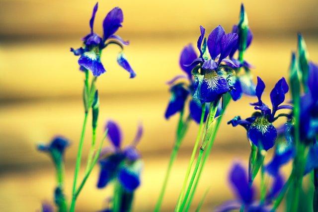
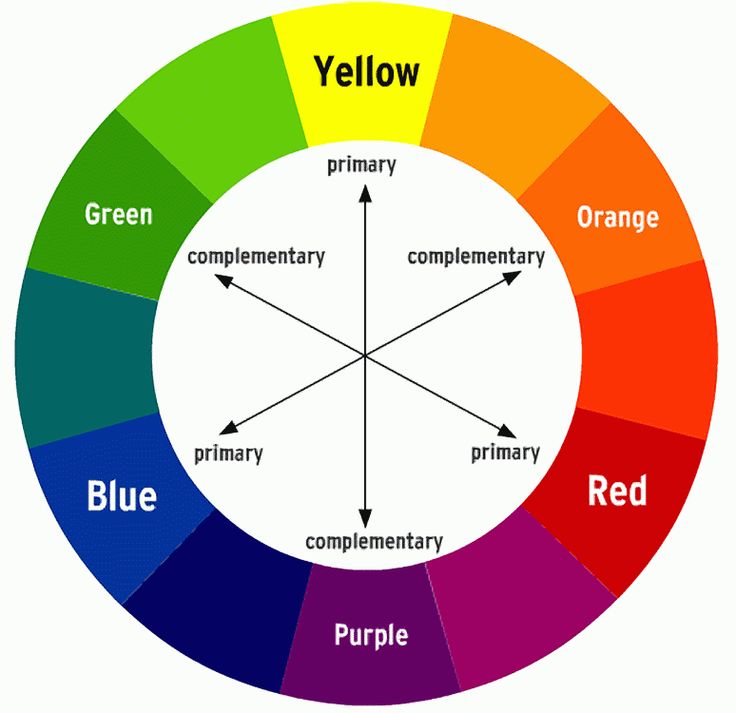
ColorChallenge - FridayBlue - Do you know what complimentary colors are?
Some of you may already know, some still don't but if you are in photography, or painting there is such a thing called "A Color Theory". It is a very extensive topic and if you get involved in a discussion you might be lost in a limbo. But we like it simple here on Steemit, don't we?
One of the most important and basic parts of Color Theory is called "Complimentary Colors" which means that some particular colors look very nice and appealing when put together in one frame, while others do not. Of course, all rules have exceptions and this is used for guidance and reference mostly.


David @BeScouted

I didn't know about the theory... I just look at the colors and I like them or I don't :p
But seems that nature does know about it. And those Irises use it.
Oh, that's the name of the flower, tight, you sweet gardener :)
Yeaaaa I secretly sneaked in the name ;)
Great tutorial post, I learnt this years ago but it had slipped my mind thanks for the reminder
You are welcome :) Just more of a tip post maybe? I am thinking of doing a series of tutorials when/if i hit 1k followers to have a bigger audience. These require more thought and time input.
Yes that makes sense, I am thinking of doing a couple myself, but finding tme between taking and editing photos and our day jobs is such a challenge
I've done a couple tutorial posts and I can tell you they do well. People react very positively to them :)
OK thanks thts good to know
That s helpful. I got it now, I thought green is primary
You get green when you mix Blue and Yellow, hence it is a complimentary color :)
Yes! I knew this.. I used to use a color wheel like this back when I was making websites in one of my first jobs. I haven't thought about this in years! Great tutorial and reminder mate! thanks :) I definitely need to keep this in mind more!
I forget it often too, usually that would be a job of a wardrobe or set designer :) And if you were making websites i am sure you knew this one. It's like rule of thirds on composition.
It sure is, it's funny how quickly you forget about stuff like that though when you aren't using it every day :)
Probably, that is how the brain is wired, so you do not keep useless stuff in your RAM :)
@bescouted Thank you for the function, I invite you to evaluate my function. Followed.
Oh, thank you, David! Very useful information and fantastic photo! 😘😗😙😚😙🤗🤗
Since you have so many rich colors where you live, you could work with it a lot :)
hey i just followed and upvoted bro...
will u do the same please? :)