Colors and lights of Nature - watercolor /// Colori e luci della Natura - acquarello
Colors and lights of Nature

2 0 1 8
watercolor on paper - big size -

When I paint a landscape, especially with the technique of watercolor, I try to invent as much as possible, but also to draw on my knowledge.
A classical landscape is usually composed of the elements of nature: sky, earth, water, clouds, trees or vegetation, hills or mountains.
To these elements some painters add ancient or modern buildings, or other mobile objects such as boats, bicycles, etc.
On other occasions we also have the representation of human figures, but they must be very small and not overwhelm the landscape, because the main subject is still nature, otherwise it would be a figurative theme.
The result of the union or the choice of these elements produces a vision, an image, a picture.
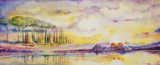
The watercolor that I share today is a result of a pure compositional invention, but very studied from the chromatic point of view.
It is a dialogue between complementary colors, that is, those pairs of colors that need each other to establish themselves and exalt each other.
Like a good husband and wife couple.
With complementary colors Vincent Van Gogh created the greatest chromatic and introspective masterpieces of the last century.
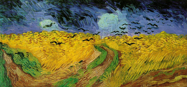
Vincent van Gogh Wheat Field with Crows (1890)
Observe the contrast and the chromatic exaltation between the yellow ocher grain with orange tips and the intense blue of the sky.

The complementary colors were much used later by the great Espressionist painters who exalted them with their suffered and introspective creations.
In a future post I will discuss in great detail the theory of color, primary colors and secondary colors.
As you can see in the painting, we have yellow-orange tones and purple-blue shades.
All my landscape is set on the vibrant play of complementary colors.
Yellow and orange have their complementary in purple and blue.
_-_Wheat_Field_with_Crows_(1890).jpg)
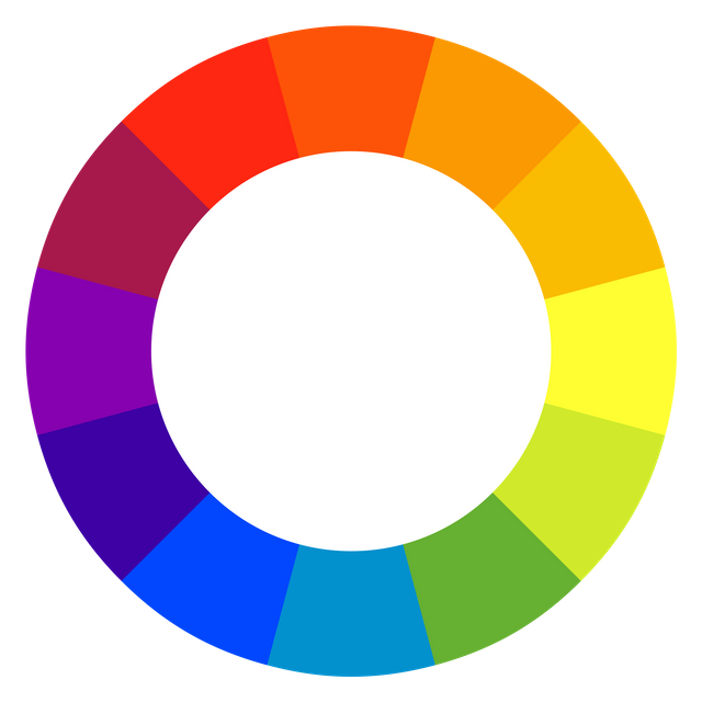
As shown below in the table that represents the color circle with two pairs taken for example: purple and yellow, orange and blue; they are complementary.
source
These pairs of colors, in the studies of optics, bound to art, we find them perfectly visible in the chromatic circle, by subtractive synthesis.
while the additive synthesis concerns the physics and the chromatic spectrum and enters other sectors of science.
They are pairs of colors with a specific reciprocal value, and that complement each other.
If we want to achieve the maximum contrast between two colors, we use complementary pairs.
This optical effect is called simultaneous contrast two opposing colors side by side exalt each other generating a very strong contrast, and both will be more saturated, that is more pure.
In conclusion, if we want to achieve saturated and exciting color contrasts we must necessarily rely on the use of complementary colors.
These elementary notions, photographers and painters should know them well.
A hug in color.
Armando
.jpg)
uso dei complementari nel mio acquarello
use of the complementaries in my watercolor
.jpg)
Quando dipingo un paesaggio, soprattutto con la tecnica dell'acquarello, cerco di inventare il più possibile, ma anche di attingere alle mie conoscenze.
Un paesaggio classico è di solito composto dagli elementi della natura:cielo, terra, acqua, nuvole, alberi o vegetazione, colline o montagne.
A questi elementi alcuni pittori aggiungono edifici antichi o moderni, oppure altri oggetti mobili come barche, biciclette automobili ecc.
In altre occasioni abbiamo anche la rappresentazione delle figure umane, ma esse devono essere molto piccole e non sovrastare il paesaggio, perchè il soggetto principale rimane sempre la natura, altrimenti sarebbe un tema figurativo.
Il risultato dell'unione o della scelta di questi elementi produce una visione, un'immagine, un quadro.
L'acquarello che oggi condivido è un risultato di una pura invenzione compositiva, ma molto studiato dal punto di vista cromatico.
E' un dialogo tra colori complementari, cioè quelle coppie di colori che hanno bisogno l'uno dell'altro per affermarsi ed esaltarsi reciprocamente.
Come una buona coppia di marito e moglie.
Con i colori complementari Vincent Van Gogh creò i più grandi capolavori cromatici e introspettivi del secolo scorso.
Vincent van Gogh Wheat Field with Crows (1890)
Osservate il contrasto e l'esaltazione cromatica tra il grano giallo ocra con punte di arancione ed il blu intenso del cielo.
I colori complementari furono molto usati in seguito dai grandi pittori Espressionisti che li esaltarono con le loro creazioni sofferte e introspettive.
In un prossimo post affronterò molto dettagliatamente la teoria del colore, dei colori primari e dei secondari.
Come potete osservare nel dipinto, abbiamo toni gialli-arancio e tonalità viola-blu.
Tutto il mio paesaggio è impostato sul gioco vibrante dei colori complementari.
Il giallo e l'arancione hanno il loro complementare nel viola e nel blu.
Come si evince qui sotto nella tabella che rappresenta il cerchio cromatico con due coppie prese ad esempio: il viola e il giallo, l'arancione e il blu.
source
Queste coppie di colori, negli studi di ottica, vincolata all'arte, le troviamo perfettamente visibili nel cerchio cromatico, per sintesi sottrattiva.
mentre la sintesi additiva riguarda la fisica e lo spettro cromatico ed entra in altri settori della scienza.
Sono coppie di colori con uno specifico valore reciproco, e che si completano a vicenda.
Se vogliamo ottenere il massimo contrasto tra due colori, usiamo coppie di complementari.
Questo effetto ottico è chiamato contrasto simultaneo due colori opposti affiancati si esaltano a vicenda generando un contrasto molto forte, ed entrambi risulteranno più saturi, cioè più puri.
In conclusione, se vogliamo ottenere dei contrasti cromatici saturi ed esaltanti dobbiamo per forza affidarci all'uso di colori complementari.
Queste nozioni elementari, i fotografi ed i pittori dovrebbero conoscerle bene.
Un abbraccio a colori.
Armando


- Art teacher
- Curator of cultural activities
- Artistic director and President of the Cultural Association "I Colori della Vita"
https://www.icoloridellavita.life/
You are not only an artist but scientist as well! :) Thank you for this deep analysis of colors. It is exciting to see the chart and understand the complimentary colors. I actually love the combination of purple/blue but I usually add something pink to it as well. This is the combination that I like the most.
You did a great job with your painting. As you said, all colors pop up and they are all pure and clear. It's a beautiful composition and it makes me think of a wonderful amazing summer afternoon spent somewhere near a lake :)
Thank you for sharing yet another masterpiece, Armando!
Thanks to you @delishtreats who have commented so beautifully!
Your art looks so nice! I've always wanted to try watercolor painting, it always seems so elegant and aesthetic. ♥
Hai detto bene nel finale, queste nozioni elementari i fotografi ed i pittori dovrebbero conoscerle bene, io che non sono né l'uno né l'altro ti ho seguito con estremo interesse, in quanto hai fornito concetti validi e di facile comprensione, indispensabili per profani come me!!
Si Marco la teoria del colore è la Bibbia per un pittore, lo sarebbe anche per i fotografi, ma ormai con il digitale si può fare qualsiasi cosa.
Your posts are always so cool and interesting, Armando! This Network is lucky to have you around! 😃
thank you friend I m in love with Art and even my student
This post was curated by the Steemit-Italia curation team in collaboration with the Curation Collective Discord community and it was upvoted and resteemed by vote trails of @steemit-italia and @c-squared community accounts after manual review. Vote c-squared as witness to support this initiative!
Wow so beautiful, i will like you to see one of my latest artwork...i am still and upcoming artist on steemit 😂😂
Click on the link 👇 👇 to see the full post
my hyperralism drawing
Hello @armandosodano, thank you for sharing this creative work! We just stopped by to say that you've been upvoted by the @creativecrypto magazine. The Creative Crypto is all about art on the blockchain and learning from creatives like you. Looking forward to crossing paths again soon. Steem on!