On-chain Metrics(Part-2)- Steemit Crypto Academy- S4W3- Homework Post for @sapwood
 Image edited by me in Powerpoint
1. What is the difference between Realized Cap & Market Cap, How do you calculate Realized Cap in UTXO accounting structures? Explain with examples?
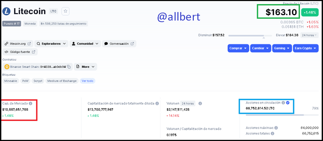
Image taken from: Source
So from what we can see the market cap is a reflection of the general and current value of an asset, while on the other the Realized cap is a reflection of the value of the asset at a specific point in time. That specific point refers to the last occasion when the currency/ UTXO moved.
In fact, the Realized cap is nothing more than the sum of all the currencies that moved, at the price on the day the movement occurred.
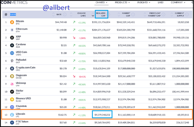
Image taken from: Source
Therefore, another difference we can appreciate is that the Market Cap is updated every time the asset price goes up or down or new coins are issued or burned.
In contrast, the Realized cap is updated every time the currency is moved (sold) because it takes into account the price of the asset at that time, which could have been weeks, months, or even years ago. In fact, a problem with the market cap is that it gives the same value to all UTXO's when in reality each UTXO has a different value. That difference is given by the Realized cap.Let's imagine a hypothetical situation in a hypothetical cryptocurrency that has a circulation of 100 coins and a current price of 30 USD
On the other hand, let's imagine that the 100 coins are distributed in 5 UTXO's which have the following data:
| UTXO | Close Price | Quantity of Units |
|---|---|---|
| 5 years ago | 2 USD | 25 |
| 1 year ago | 10 USD | 30 |
| 6 Months ago | 25 USD | 15 |
| 1 Months ago | 26 USD | 20 |
| 1 week ago | 29 USD | 10 |
While the Market Cap is: 100x30= 3000 USD.
Realized cap is: (2x25)+(10x30)+(25x15)+(26x20)+(29x10)=1445 USD.
Realized cap relative to the market cap is a measure of how the asset has performed in terms of return. We know that the lower the Realized cap the more profitable the asset will be, but for this to happen the UTXO's where the lower price movements are recorded, should be the ones with the highest amount of units. For example, for the same amount of coins let's see a different UTXO distribution.
Realized cap: (2x50)+(10x30)+(25x15)+(26x4)+(29x1)=908 USD.
In other words, this translates to there should be more tokens held than in motion. This is consistent with the law of supply and demand, in which an asset that has been holdover for a long time increases in value by not offering the necessary supply to the market.
On the other hand, a high Realized cap indicates a lower yield, because it means that there were more coins in motion lately, increasing the supply and decreasing the price of the asset.
In fact, it can be the case where the Realized cap is higher than the market cap. This only occurs in bear markets and is a product of a large sum of currencies having moved at a time when the asset price was higher than the current price. For example, let's consider the original distribution, with extremely high prices in the last 3 UTXO's.
Realized cap: (2x25)+(10x30)+(100x15)+(120x20)+(80x10)=5050 USD
Which is much higher than our Market cap = 3000 USD and is reflective of an evidently bearish market.
To understand the relationship between the Market cap and Realized cap a little better and from another point of view, let's consider Block 79600 of the Bitcoin network which was mined on September 13, 2010. It generated a transaction of 50 BTC delivered to the miner. Data taken from Blockchain Explorer .
Image taken from: Source
On the other hand, for the Realized cap, those coins would be joined to the rest of the coins in the same UTXO, i.e. those that have not moved since then, and multiplied by the price of BTC at that time (0.062 USD), which would give a total of 3.1 USD.
What we see here is that the Realized cap shows us the potential value of the coins that have not yet moved.... (a batch of coins that at the time was worth 3.1 USD, if it were to be moved now would be worth 2,100,000 USD). If we wanted to perform a more accurate example, we should through Blockchain explorer locate all the coins that have remained unmoved, multiply them by their price at the time and add them up.2. Consider the on-chain metrics-- Realized Cap, Market Cap, MVRV Ratio, etc, from any reliable source(Santiment, Glassnode, etc), and create a fundamental analysis model for any UTXO based crypto, e.g. BTC, LTC [create a model for both short-term(up to 3 months) & long-term(more than a year) & compare] and determine the price trend/predict the market (or correlate the data with the price trend)w.r.t. the on-chain metrics? Examples/Analysis/Screenshot?
REALIZED CAP
SHORT TERM (3 months)
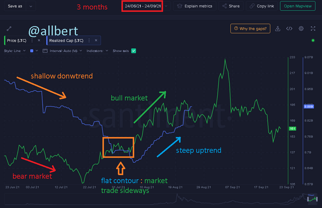
Image taken from: Source
LONG TERM (3 years)
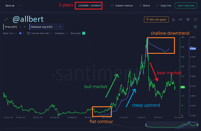
Image taken from: Source
Then at the end of 2020, the bullish rally occurs and the price soars from USD 75 to USD 393 4 months later. In all this time, the realized cap showed a totally steep bullish contour, thus affirming the strength of the trend.
On the other hand, the interesting thing happens after the bullish phase. In May it starts a strong bearish phase, which made the price fall from 393 to below 120 USD. However, in this time the realized cap as expected did not fall steep but described a shallow decline, which means that people were reluctant to divest their positions even with the fall of LTC. The explanation for the latter pattern obeys a psychological explanation. Even with the falling price people keep the faith that the asset will rise again, moreover, if they were to dump their coins they would do so at a loss... such reason, most decide to wait, and only a few dump their coins. For such reason, the Realized cap describes only a slight downtrend that seems not to be in line with the asset's fall.MARKET CAP
SHORT TERM (3 months)
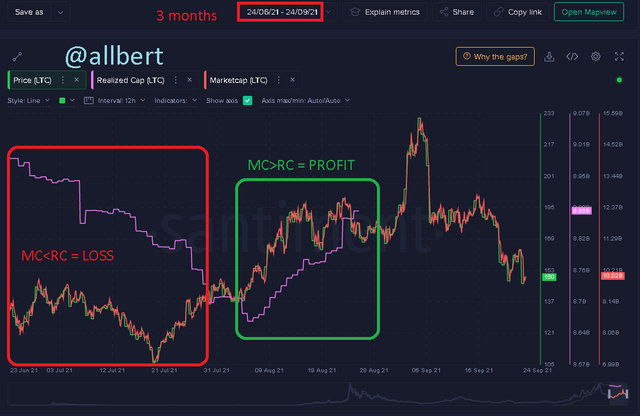
MC: market cap, RC: realized cap. Image taken from: Source
LONG TERM (3 years)
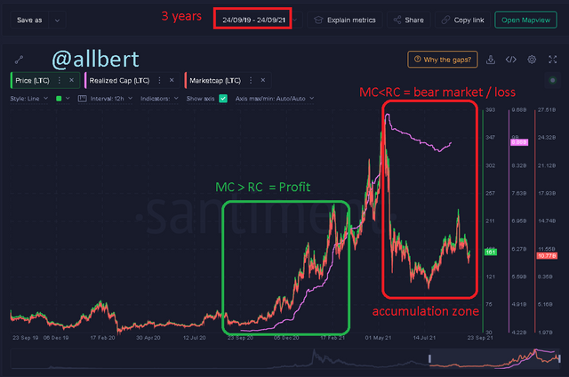
MC: market cap, RC: realized cap. Image taken from: Source
MVRV RATIO
SHORT TERM (3 months)
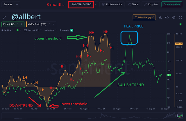
Image taken from: Source
Time proves him right, and next the MVRV starts to show higher highs HH1= -2.24%, HH2= 14.35%, HH3= 22.8%, HH4= 33.93%, HH5= 44.21%, HH6= 44.7% and higher lows HL1= 8. 43%, HL2=17.99%, HL3= 29.21%, HL4= 30.39% , HL5= 33.95%, all above 1%; which is a clear indication of a bullish market period with a strong trend.
Here something interesting happens again, during the uptrend, the MVRV produces an upper threshold at 44.21%, which to the untrained eye could mean a trend change, however, what happens is that the price corrects and then resumes the uptrend forming another HH at 44.7%. This next higher high in the MVRV indicates the possibility of price peaking in the next few days, which is confirmed almost a month later. This means that the MVRV can help us predict future price movements.LONG TERM (3 years)
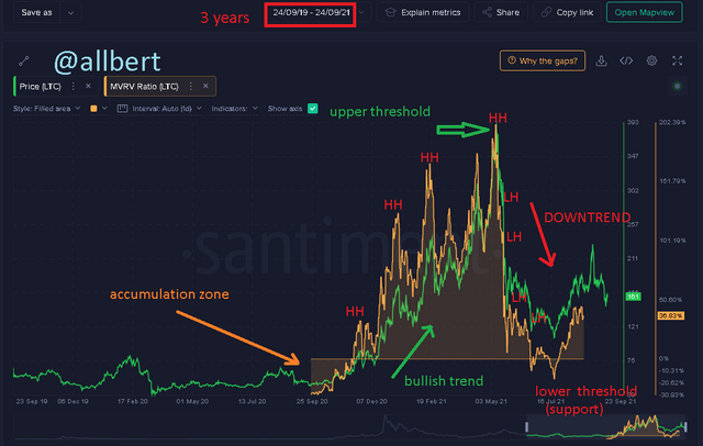
Image taken from: Source
3. Is MVRV ratio useful in predict a trend and take a position? How reliable are the upper threshold and lower threshold of the MVRV ratio and what does it signify? Under what condition the Realized cap will produce a steep downtrend? Explain with Examples/Screenshot?
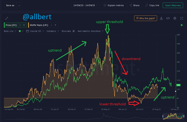
Image taken from: Source
An upper threshold indicates that the uptrend has already reached its top, and that it is now time for the price to correct in a distribution period, therefore it is expected to start a downtrend, so traders can take this indicator as a sell signal.
However, this signal then needs to be accompanied with the MVRV forming lower and lower highs to confirm the trend change.On the other hand, a lower threshold tells us that the downtrend has already reached its top, and that now the price has entered an accumulation phase, therefore it is expected to start an uptrend, so traders can take this indicator as a buy signal.
However, this signal then needs to be accompanied by the MVRV forming higher and higher highs to confirm the trend change.On the other hand the confidence of both signals is not the same due to some factors.
In the case of the lower threshold (MVRV < 1%) it is a much more reliable signal of trend change as it indicates an accumulation zone where the asset collects the necessary liquidity to start a new bullish phase. However the upper threshold is a less reliable signal as it does not always represent the end of an uptrend but a price correction as we will see, especially if the upper threshold MVRV is below 200%. This effect is entirely psychological, since when a first peak occurs (UT1) a certain group of marginal traders sells their assets mistakenly believing that the uptrend came to an end. This naturally causes the price to correct, which can be taken by other traders as a buy signal... which in turn causes the main uptrend to resume.In an asset behaving under Elliot waves, this can happen up to twice before reaching the final upper threshold, as is the case in this example.
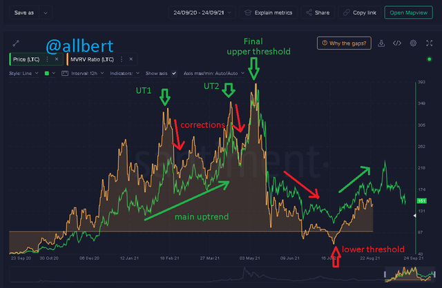
Image taken from: Source
Under what condition the Realized cap will produce a steep downtrend? Explain with Examples/Screenshot?
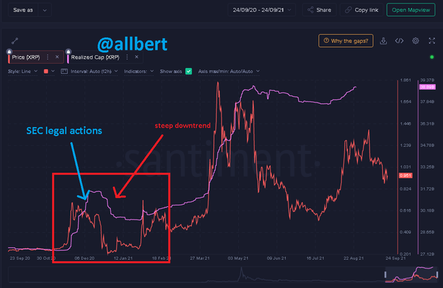
Image taken from: Source